Max Cenci
Product Designer & Founder of RVC Design
Work

TC Co-Pilot™

Convert™ & Finance Navigator™

EV Rental Start-Up App

Premier Padel Score (In progress)
About me
I am a pragmatic and passionate product designer with experience across consumer and enterprise design. I have delivered meaningful solutions for a diverse set of clients, from automotive financial services, private health clinics, to commercial banking corporations.Over the years I’ve been creating functional, delightful, and valuable experiences that leave a hugely positive impact on people and businesses.
Testimonials
From day one, Max brought curiosity and enthusiasm to every task. Over time, he’s transformed that energy into tangible impact. His ideas are creative yet grounded, always ready to challenge the status quo in constructive ways that elevate the whole team and the user experience. What really stands out is his ability to communicate effectively.He’s vocal in the best possible way: clear, thoughtful, and eager to collaborate. And when questions or pivots arise, he’s not just reactive, but proactively offering solutions and support. On one memorable occasion, as I was with a client, and adding comments to the figma design, he was fixing the issues live during my meeting, so by the end, the client had all the changes they requested or feedback where he thought it was inappropriate. They were so impressed by our responsiveness and willingness to find a solution for them.Dale Reed, VP of Product Management
As Max’s line manager, it has been a pleasure to witness his growth since his early days with the company. Max has made exceptionally valuable contributions to the UX team at iVendi. He played a pivotal role in developing our product Design Systems and led the UX design for key strategic projects such as newvehicle.com, Webshops, and Convert.Max demonstrates the ability to work autonomously and confidently lead UX design within cross-disciplinary product and agile teams. I wholeheartedly recommend Max if you are seeking a Senior UX Designer.Darren Armstrong, Head of UX
Max has been really great to work with, and the working relationship has strengthened this year. He has met expectations and delivered good quality work across all requested initiatives. Always open and candid in expressing his opinions and views on design approaches, Max maintains a respectful and collaborative mindset, which is highly appreciated.He works very quickly and efficiently, often delivering results within a day once requirements are finalised. His skills and efforts are valued, and his strong work ethic is consistently recognised.Patrick Brown, Product Manager
Contact Us
Want to work together? Get in touch.
Convert™ & Finance Navigator™
A UX-Driven Solution to the Problems Within Automotive Financial Applications
Research & Analysis: Research: Uncovering Frictions in the Online Vehicle Finance Journey
At iVendi we brought together research, sales, data and UX specialists with a single ambition: to set the industry standard for applying for finance on any dealer's site. Our existing Convert widget, which embedded into dealer sites already let users generate finance quotes via lender API's, and also reserve, or even buy outright. Yet once buyers decided to apply for finance the experience quickly lost momentum, offered little reassurance and left many applicants facing unnecessary rejections. We needed a solution that would remove friction and ambiguity, and restore confidence, a product that would later become Finance Navigator.We began by observing real customers as they applied for finance through our existing software. External user‑testing platforms captured click paths, time on task and facial cues, giving us rich evidence of their motives and struggles. Participants consistently cited four pain points: opaque industry terminology, poor visibility of progress through the form, clumsy navigation between sections and no way to review or correct details once they had moved on.To benchmark our findings we analysed the journeys offered by leading lenders and comparison sites. The best competitors signposted application buttons clearly, split their forms into logical chunks and sped up data entry with postcode look‑ups and number‑plate recognition. They still fell short in key areas: users could not track their application online, part‑exchange valuations were handled offline and status transparency was almost non‑existent. Turnaround times were admirable, yet the overall experience lacked clarity and control.Workshops with compliance officers, industry experts and internal stakeholders revealed several optimisation levers. Pre‑populating known data could cut drop‑off dramatically, login gates needed to appear at the start rather than mid‑journey, and asking for bank details only at the final step preserved user engagement. Crucially, we learned that non‑prime applicants could often qualify for prime rates if asked a handful of additional questions, while many prime customers could be pre‑approved after answering only the basics. This insight inspired the concept of an adaptive form flow that flexed to each user’s credit profile.Usage analytics showed that most visitors accessed dealer sites on mobile, but Convert’s application flow had never been fully optimised for small screens. Long input fields, limited feedback and fixed page lengths forced users to pinch, zoom and scroll. The resulting frustration contributed to abandonment rates and, for those who did persevere, a hard credit check that often ended in a refusal. Protecting credit scores and improving mobile usability became immediate priorities.Together, these strands of evidence pointed to a clear opportunity: a central hub where customers could apply, track and manage their finance journey in one place. Finance Navigator, embedded within Convert and optimised for mobile, would deliver soft‑search eligibility checks, transparent status updates and jargon‑free guidance, reducing rejections and building trust every step of the way.
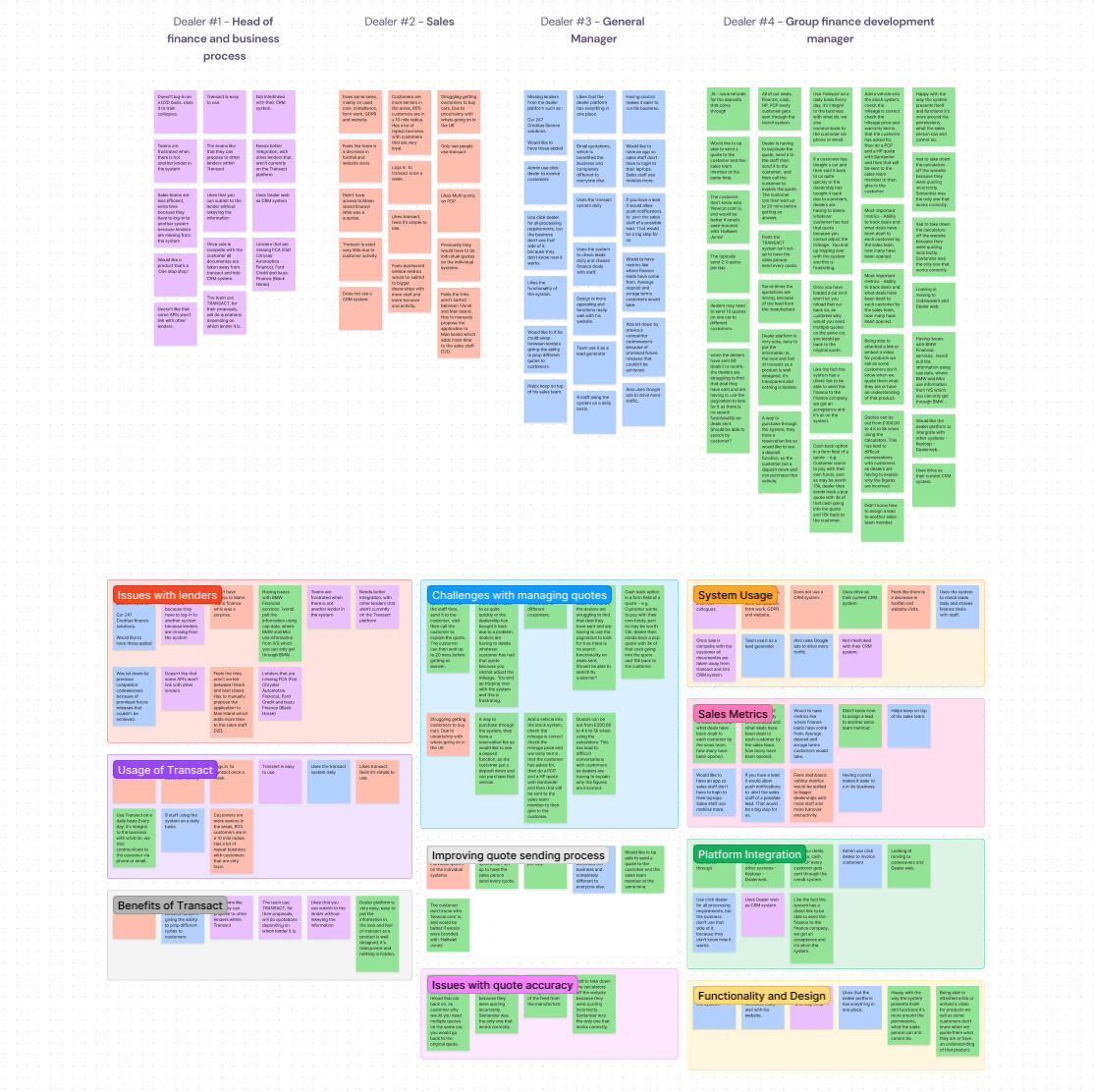
Analysis & Approach: Crafting a Tailored Experience We're Confident In
Synthesising our research insights, we identified four strategic priorities. First, we would protect customers’ credit scores by implementing soft‑search eligibility checks up front. This would allow users to discover their likely outcomes across multiple lenders without any hard inquiry, alleviating anxiety and reducing wasted lender resources. We also aimed to reassure the user throughout that their credit would not be affected with Finance Navigator.Second, we committed to demystifying finance language through a layered information strategy. Primary labels would use plain, friendly English, supported by concise, tooltip‑activated explanations. An omnipresent glossary of terms, accessible through a fixed link, would allow users to explore definitions without losing their place in the form.Third, we embraced FCA guidelines and lender focus on pre‑approval as a badge of quality. By highlighting pre‑approved offers early and visually distinguishing them from indicative quotes, we would build user trust and align with the FCA's encouragement of responsible lending. This emphasis on pre‑approval would also serve as a powerful marketing proposition for dealers and lenders.Finally, we re‑imagined our commercial model. Moving away from a fixed‑fee widget licence, we proposed a performance‑driven commission structure, tying our success to completed, approved applications. This realigned incentives across iVendi, dealers and lenders, fostering stronger partnerships and reducing perceived risk for integration.Throughout the planning phase, we translated these strategic pillars into low‑fidelity prototypes and user‑flow diagrams. Technical feasibility reviews ran in parallel, ensuring that our vision could be delivered without major architectural hurdles. We iterated rapidly, testing assumptions about form length, field order and error‑handling with small user cohorts. Each round of feedback drove refinements to layout, phrasing and fallback states.To conclude, while Convert already offered a seamless and dealer-branded way for users to generate quotes, reserve vehicles, and even complete outright purchases, we recognised that the traditional finance application process within it wasn’t serving consumers as effectively as it could. Rather than dismantling what already worked well, we made a conscious decision to preserve Convert’s intuitive user experience and clean integration into dealer websites. However, when it came to starting a finance application, we redirected users to Finance Navigator. This allowed us to guide customers through a credit-friendly, eligibility-first journey that protected their credit scores and provided greater transparency from the outset. By combining the strengths of Convert with the safeguards and clarity of Finance Navigator, we created a journey that kept users engaged while better serving their financial well-being.So, with a finalised, validated prototype in hand, the new Finance Navigator product and Convert's overhaul were ready to be built.
My Solution: A Human-Centred Design Approach
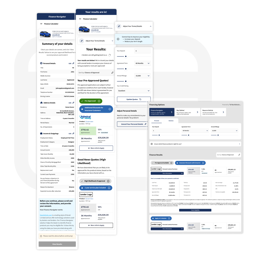
The New & Improved Convert WidgetThe Convert widget acted as the foundation for our finance solution and had already proven its value across thousands of dealership websites in the UK and Germany. It was fully customisable to reflect each dealer’s brand, providing users with a visually familiar and trustworthy experience. From this interface, customers could view a vehicle, adjust terms such as deposit amount and agreement length, and instantly see finance quotes tailored to their preferences. It also offered the ability to reserve the vehicle or buy it outright with cash, creating a seamless purchase journey. This flexibility and ease of use were key strengths we were keen to preserve.What was missing, however, was a way for users to gain clarity on their likelihood of approval before committing to a full finance application. The Convert widget previously allowed customers to apply directly for finance after generating a quote, but without any eligibility check. This meant that a large proportion of users were applying without knowing whether they were likely to be accepted, often resulting in rejection and a hard credit search on their file. To address this, we chose to reroute all finance application flows from Convert directly into Finance Navigator. This new flow introduced a user-friendly, credit-safe journey that prioritised pre-approval and gave customers confidence before moving forward.When users now view finance options in Convert and choose to apply, they are taken seamlessly into Finance Navigator. The branding remains consistent, and the vehicle details are pre-filled, maintaining continuity and reducing effort for the user. Finance Navigator then performs a soft credit search behind the scenes, showing customers what lenders are likely to approve them, or if they’ve already been pre-approved. This shift not only improves the customer experience by reducing credit risk and increasing transparency, but also significantly improves the quality of applications received by lenders and dealers, making the entire process more efficient for all parties involved.
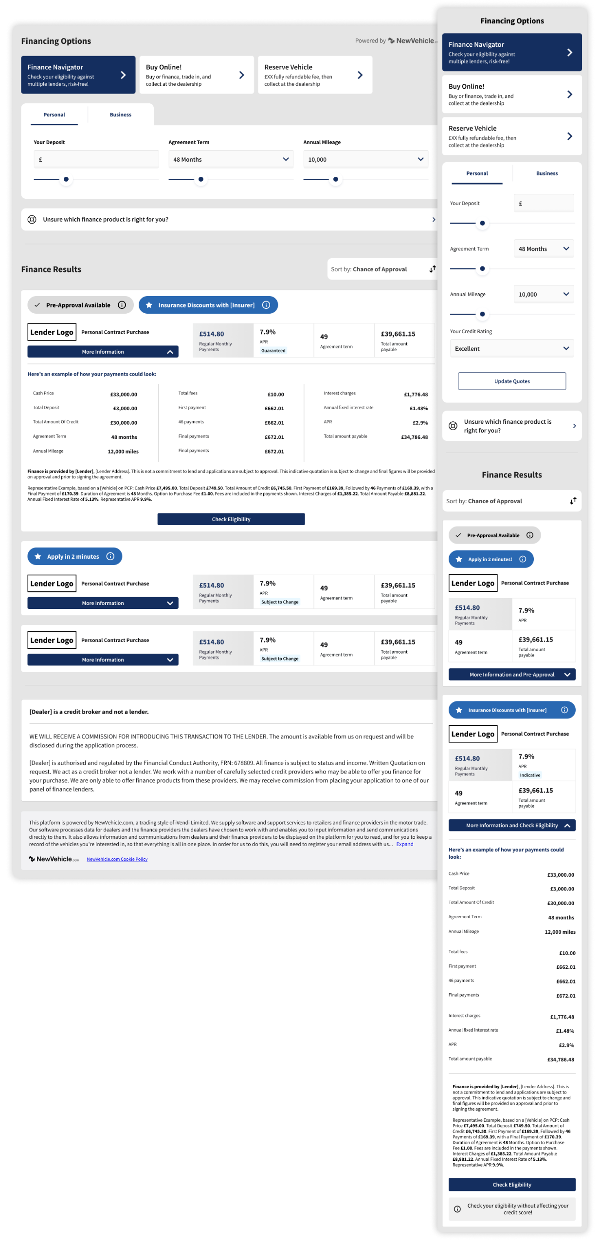
Accessing & Completing Finance NavigatorThe Finance Navigator form takes centre stage in the renewed journey, guiding customers through a clear, credit‑friendly pathway that feels as straightforward as an everyday checkout. From the moment the form loads, users are welcomed by conversational copy, immediately setting a reassuring tone. Each question is phrased in plain English rather than financial jargon, making it easy for first‑time buyers and seasoned motorists alike to understand exactly what is being asked.To support this language strategy, we embedded an always‑available Glossary link. Clicking it opens concise definitions in a new tab, so users never lose their place in the flow. In addition, unobtrusive tooltip icons sit beside potentially ambiguous fields. Tapping these icons reveals bite‑sized explanations that clarify why the information is needed and how it will be used, cultivating transparency and trust.Navigation is streamlined by a dynamic progress bar that doubles as a roadmap. Users see upfront how many steps remain and can jump back to earlier sections to amend details without triggering validation errors. Behind the scenes, an adaptive logic engine hides unnecessary questions for customers who already meet prime lending criteria, while surfacing extra fields for non‑prime applicants to bolster their approval chances. Address and vehicle lookup APIs further accelerate completion times, auto‑filling data wherever possible and reducing manual entry.This thoughtful blend of friendly language, contextual help and adaptive flow transforms what was once a daunting finance application into a guided, confidence‑building experience. By removing anxiety around hard credit checks and ensuring every interaction is clear and purposeful, Finance Navigator not only improves submission quality for lenders but also empowers consumers to proceed with certainty.
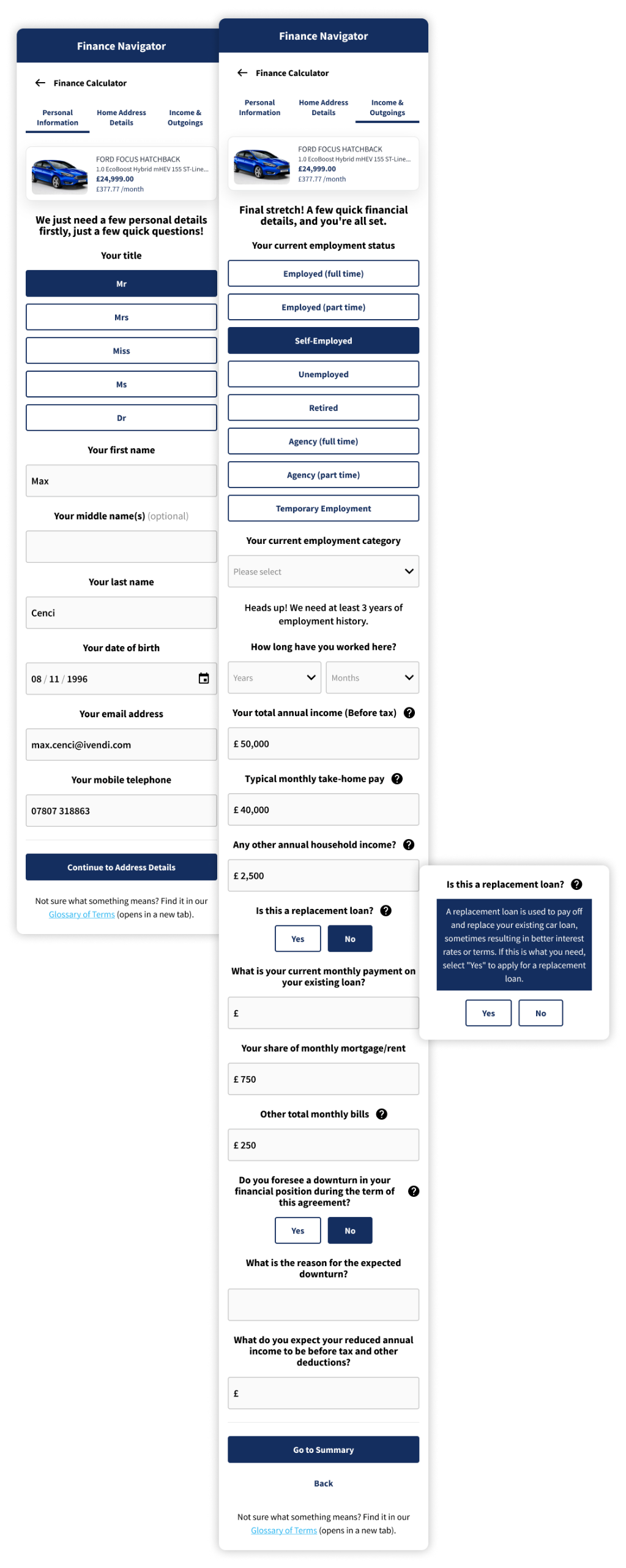
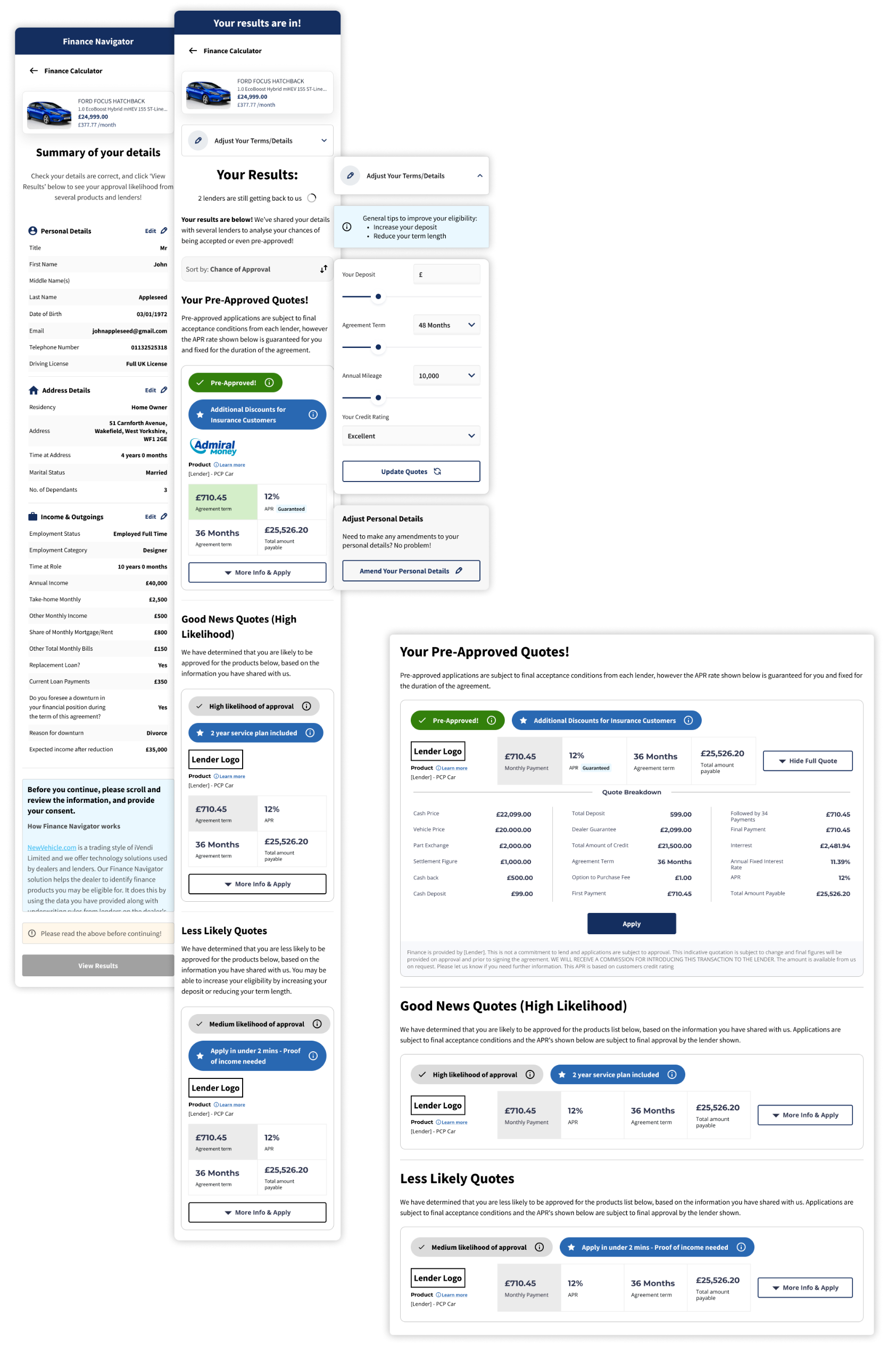
Results - The Final Problem SolutionThe results screen plays a vital role in achieving one of Finance Navigator’s core goals: reducing the number of rejected finance applications by giving customers full visibility of their likelihood of approval before they commit. Rather than asking users to blindly submit a full application, we surface soft-search results from multiple lenders in a clear, categorised layout that empowers them to make informed choices.Offers are grouped by chance of approval, starting with clearly marked pre-approved results. These sit at the top of the page and are accompanied by reassuring messaging that encourages users to proceed with confidence. Below that, results are separated into likely and possible outcomes, giving users realistic expectations and helping them avoid options that may lead to a rejection. This visibility into their standing with different lenders helps prevent unnecessary damage to their credit scores, while also improving the quality of applications received by lenders and dealers.Each offer is laid out with essential information such as monthly cost, APR, term length, and any associated conditions. Rather than using financial jargon, we present this information with user-friendly labels and tooltips that explain key terms in everyday language. A link to the glossary remains available at all times for further support.
To give users even more control, we included simple tools to sort or filter offers by the criteria that matter most to them, whether that's lowest monthly payment, best APR, or highest chance of approval. If a user decides they’d like to improve their results or explore different scenarios, they can easily amend key inputs like deposit amount or agreement term without re-entering all their details. New results are generated instantly, offering a smooth, flexible way to explore their options.By showing real eligibility outcomes upfront and offering a supportive, transparent experience, the results screen significantly reduces the chances of customers applying for products they’re unlikely to qualify for. This not only improves consumer outcomes but also protects lender resources and builds long-term trust across the entire finance journey.
To conclude:
This project set out to solve some of the most persistent and damaging problems in the online vehicle finance space, and we surely delivered! By combining our trusted Convert widget with a newly developed, user-centred Finance Navigator, we created a full journey that not only supported customers through their decision-making, but actively protected their financial wellbeing.We tackled the issue of high rejection rates by introducing soft-search eligibility checks, giving users full visibility of their chances before they applied. This alone helped reduce unnecessary hard credit searches and the stress they cause, while improving application quality for lenders. We addressed widespread confusion around financial terminology by rewriting every label and field in human language, supported by a glossary and intuitive tooltips. We solved navigation issues with a clear progress indicator, a responsive layout optimised for mobile, and the ability to amend details at any stage of the journey.We also made smart use of what we learnt about user intent and credit risk. Our adaptive form logic asked more questions only when they were truly necessary, helping non-prime customers improve their approval chances while making the experience faster and lighter for prime applicants. And by redirecting all application journeys from Convert to Finance Navigator, we ensured that every customer would benefit from this guided, credit-safe process without losing the familiarity and ease of our original tool.This wasn’t just a design improvement; it was a complete rethinking of how digital vehicle finance should work, with users’ needs at its core. In the weeks following launch, we were extremely proud of our results: £200,000+ in monthly revenue, a 93% reduction in rejected applications, and steady month-on-month growth as more lenders and dealers joined the platform. We turned deep research into action, solved genuine industry challenges, and delivered a solution that works better for everyone involved.
Norwegian EV Rental App
A UX-Driven Solution to the Problems Within Automotive Rental Apps
Research & Analysis: What should be the start to every UX project
About the client:A Norwegian venture capitalist based in Oslo, looking to create a mobile app for electric vehicle (EV) rentals in Oslo, a city at the forefront of sustainable urban transportation.The Challenge: Navigating Oslo's Unique EV LandscapeAs a freelance product designer, I was presented with an intriguing opportunity by a Norwegian founder and venture capitalist. Their vision: to create a mobile app for electric vehicle (EV) rentals in Oslo, a city at the forefront of sustainable urban transportation. My objective was clear – design a user interface prototype for an EV rental app specifically for Oslo residents who, despite not owning cars, occasionally need access to a vehicle. The ultimate goal was to integrate this app with an existing platform for managing bookings, fleet, and customers.Oslo, renowned for its compact layout and extensive public transport network, presented a unique user base—individuals accustomed to walkability and efficient public transit, not car ownership. This meant the app needed to seamlessly integrate into their existing habits, offering a convenient solution for occasional car needs.Uncovering User Pain Points: Beyond the ObviousMy design process began with thorough competitor analysis, examining major rental apps in Europe, as well as modern taxi apps to better understand their speedy and user-friendly functionalities. Through affinity mapping, I synthesised key insights:- Modern apps prioritise collecting user information upfront to minimise in-person data collection at pickup.
- Optional in-app insurance is a common offering, providing both convenience for users and an additional revenue stream for companies.
- Payment method integration before booking is encouraged for a smoother transaction.
- Vehicle filtering options (e.g., body type, range) are essential.
- User data is often reused for future bookings, streamlining the process.Booking.com Insurance Options Example:
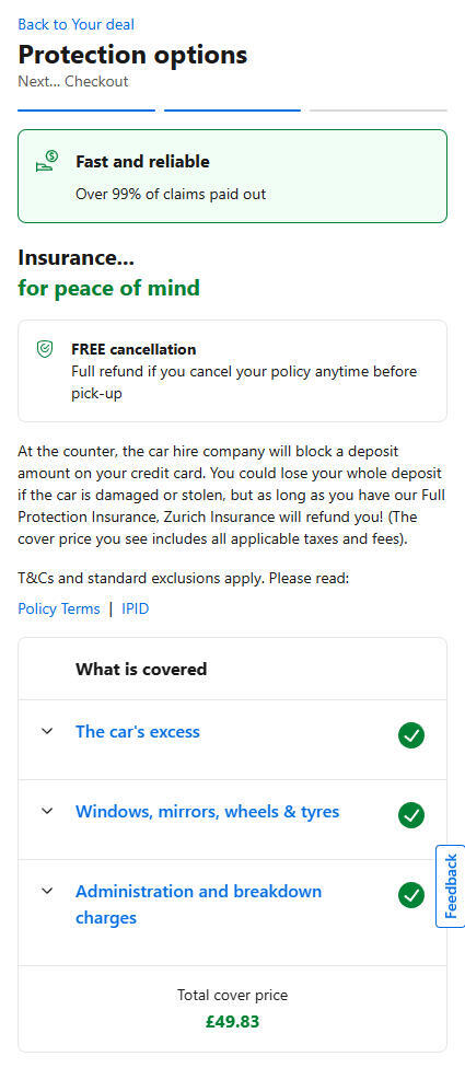
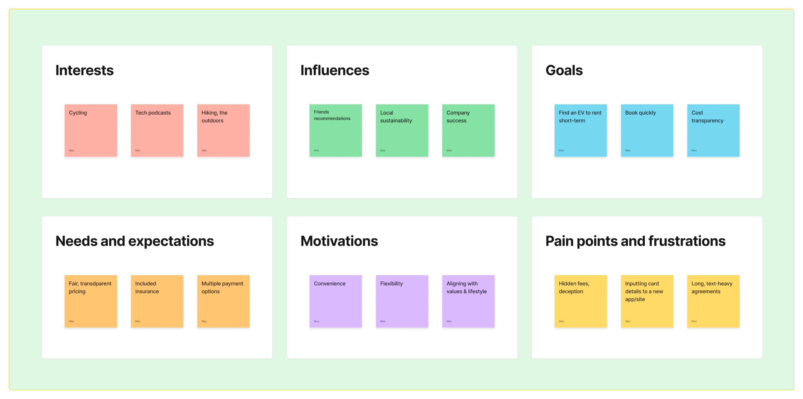
To verify and validate my own research further, I explored existing research on rental apps, uncovering critical user frustrations that design could directly address:- Hidden fees at checkout: A major source of user frustration.
- Insurance confusion: Users often struggled to understand coverage details.
- Complicated rental agreements: Lengthy and confusing terms deterred users.
- Limited payment options: Users desired more flexibility in payment methods.
- Difficulty finding nearby vehicles: Users wanted quick access to the closest car.
- Lack of social sign-up options: A barrier to quick and easy registration.- I also encountered specific Norwegian conventions, like the option to add winter equipment. While a common element, the client decided against its implementation in the initial rollout. This highlighted the need for flexibility and strategic prioritisation in design decisions.From Insight to Impact: How I addressed and solved my problem statements created from research analysisTo ensure my design genuinely addressed user needs, I approached the research and analysis phase with a structured, problem-solving mindset. Rather than simply gathering information, I aimed to extract insight and connect it directly to design decisions that would shape a smoother, more trustworthy rental experience.I began with a thorough competitor analysis, mapping out the strengths and weaknesses of leading EV rental and taxi apps in both Norway and internationally. I focused not just on what these apps offered, but how they handled key user interactions, from onboarding to payment and vehicle discovery. Through this lens, I identified several consistent friction points: hidden fees at checkout, limited payment options, confusing insurance details, poor vehicle filtering, and slow booking processes.I translated these issues into design opportunities. For example, the widespread frustration around unclear pricing became a driving force behind my decision to make cost transparency a core element. The total price, including all fees and optional extras, is displayed clearly and persistently throughout the booking flow. This not only resolves the trust issue, but also reduces drop-off at later stages.Another insight concerned user hesitation around insurance options. Instead of overwhelming users with lengthy descriptions or technical jargon, I introduced a one-click insurance add-on during booking, using plain language and visual clarity. This simplified the process while still offering choice and control.Payment flexibility emerged as another key concern. Many users were reluctant to input card details into unfamiliar apps. In response, I designed a payment section that supports multiple options, including PayPal, and ensured that users could add or remove methods with ease. This directly addressed trust and convenience, while aligning with modern payment expectations.Discoverability was also a recurring problem in competitor apps. Users often struggled to find the nearest available vehicle or filter by what mattered most to them. To solve this, I made the closest vehicle front and centre on the homepage, and implemented intuitive filters such as range, price, and body type. These were based on observed user priorities and supported by concise icons and clear sorting options.I also encountered a more nuanced challenge around local expectations. In Norway, for example, some rental services offer winter equipment as a seasonal add-on. While we chose not to implement this in the first iteration, it informed my approach to flexibility and scalability in the design. The interface was built with future add-ons in mind, allowing new options to be slotted in without disrupting the flow or layout.Crucially, I continuously tied each design element back to the user pain points I had uncovered. I used affinity mapping to cluster related frustrations and aligned each cluster with a corresponding solution within the app. This process allowed me to prioritise features that would have the highest impact, and ensured the experience felt intuitive, responsive, and tailored to Oslo’s unique rental landscape.This research-driven process grounded the entire project in real-world needs. Every insight gathered was a stepping stone to a practical, elegant design response. The result is an app that does not just function well, but actively removes the barriers that have long made car rentals feel slow, clunky, or untrustworthy.
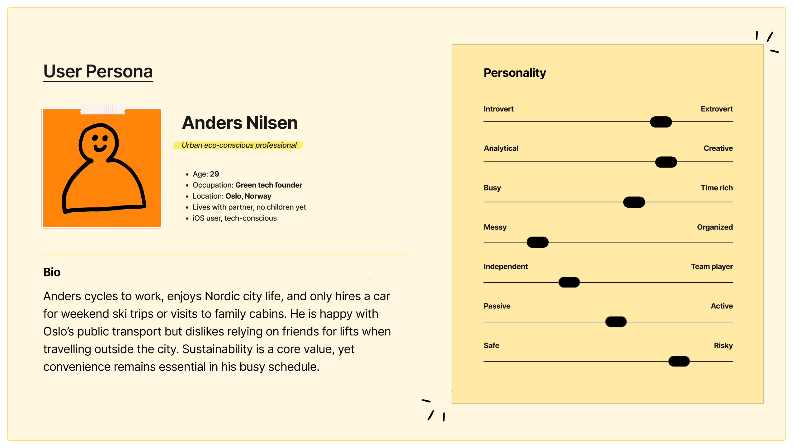
User Persona & Biography:
My Solution: A Human-Centred Design Approach
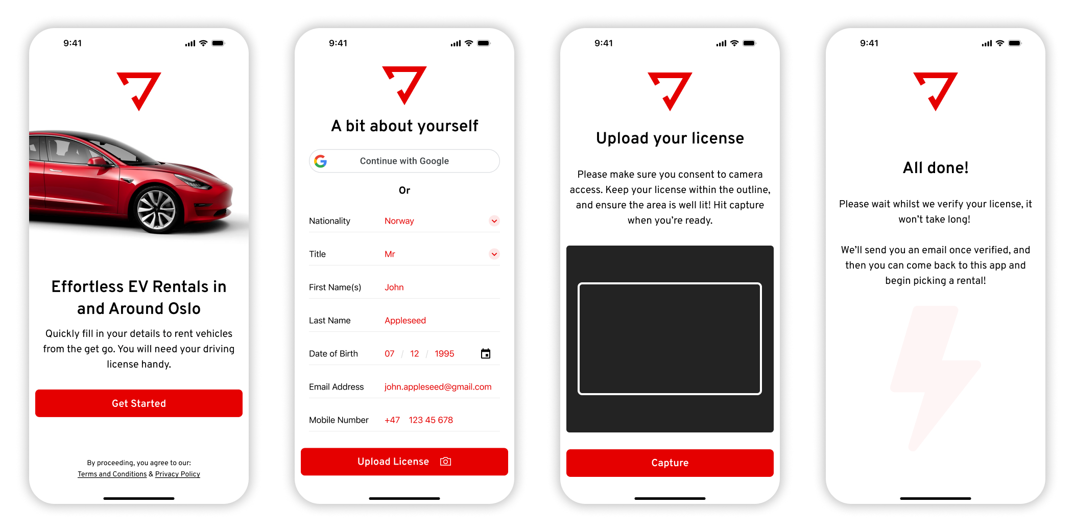
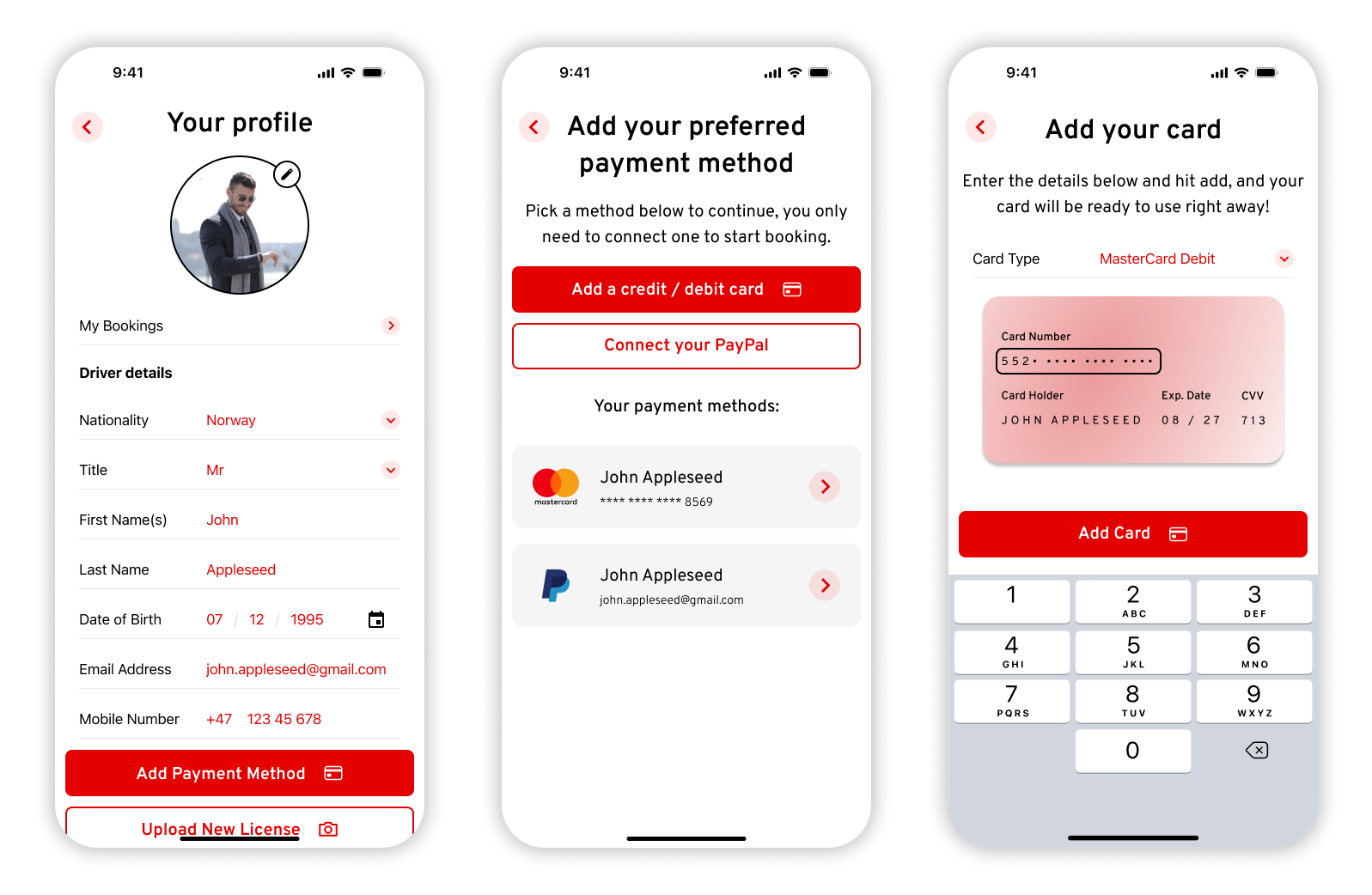
Setting the Stage: Effortless OnboardingRecognising that a strong first impression is crucial, I focused on a top-notch onboarding experience. The app prioritises collecting essential user data upfront, incorporating the option for social media logins to boost trust and expedite registration. Inspired by efficient banking app systems, I designed a seamless driver's license upload process, drastically reducing time spent at the collection point. Throughout, friendly and approachable language was used to create an engaging experience, and minimal data input, leveraging device UI for numbers and selections, was implemented to prevent user errors.
Empowering Users: Personalised Profiles and Flexible PaymentsA user's profile is vital for engagement and retention. I designed a personal and easily modifiable profile, allowing users to effortlessly update their information and re-upload their driver's license as needed.Crucially, the profile allows users to add multiple payment methods, including card and PayPal. This addresses user concerns about sharing card details with new apps, enhancing trust and security. The card upload process was designed to be modern, sleek, and visually appealing, aligning with contemporary software standards.
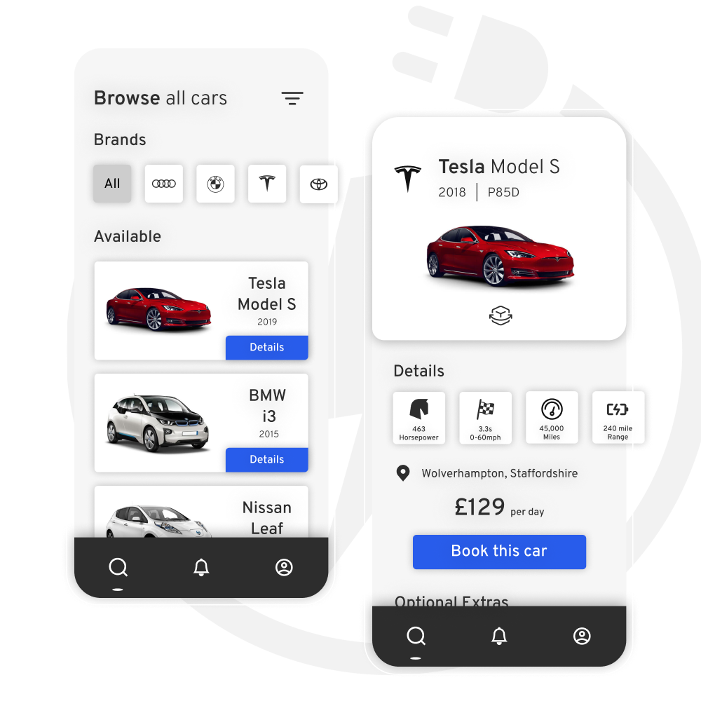
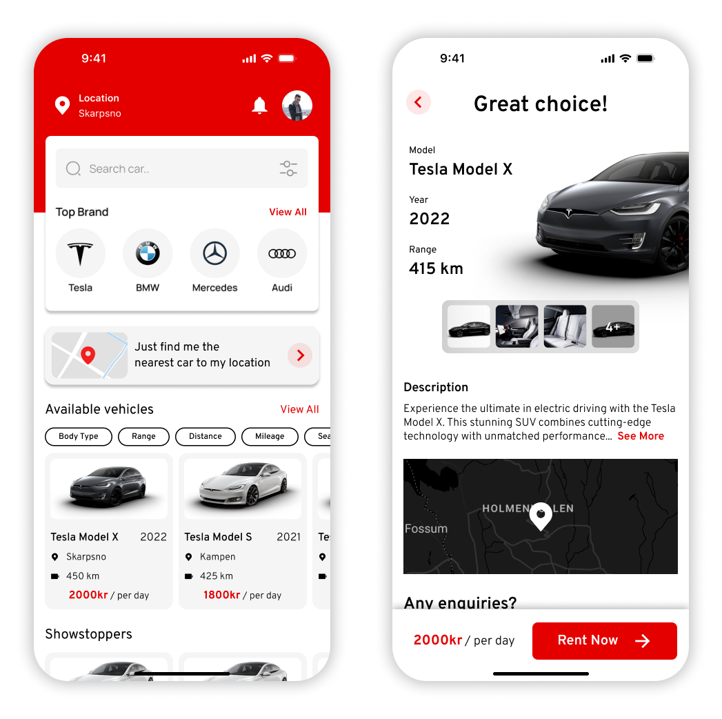
Seamless Discovery: Intuitive Home and Vehicle ViewsThe home page acts as the app's central hub, providing quick and easy access to essential features. A key problem identified was the user's desire to find the closest vehicle quickly. To solve this, I made the “nearest available vehicle” option prominent on the home page. Users can easily see and verify their current location, ensuring relevant search results. A search bar with filtering options, along with popular brands and filters sorted by popularity, streamlines the search process.Each vehicle preview displays essential statistics and an image, enabling quick, informed decisions. Notifications for messages and updates from the rental company are also clearly visible.The vehicle details page features a modern graphic of the car's front, overlayed with details for a unique and engaging introduction. To tackle confusion around pickup locations, a map is included, expandable to reveal the precise pickup point. Contact details, pricing, and a sticky “Book Now” call-to-action are also clearly displayed.
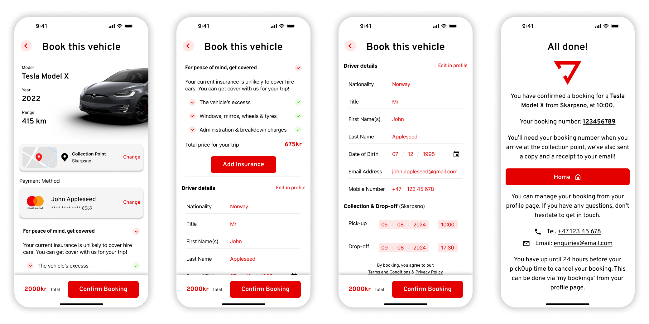
The Core Experience: A One-Click Booking JourneyMy goal for the booking process was simplicity and efficiency – a one-click experience akin to taxi-hailing apps. The booking page auto-fills previously collected information, including the default payment method. Adding insurance is a one-click option, a feature included after discussions with the team about its commonality in car rentals and its potential as a new revenue stream through commission.A critical outcome of my design was addressing the user's pain point of hidden fees. The total price is always prominently displayed, free of any hidden charges, building trust and enhancing the user experience. Upon confirmation, users receive a clear page with their reference number, contact details, and a call-to-action to return to the homepage, reinforced by a friendly confirmation message.
Looking Forward: Continuous ImprovementThis project was a testament to solving real-world user problems through intuitive design and strategic decision-making. Every design choice, from onboarding to booking, was crafted to simplify the rental experience and enhance user engagement.Reflecting on the process, I recognise the immense value of conducting dedicated user testing, especially with Norwegian users, to further optimise the app's functionality and user interface. Understanding local preferences and behaviours would be crucial for refining the app's appeal in the Norwegian market.As of now, the app is in its development phase, with each feature carefully crafted to meet user needs and exceed industry standards. My commitment remains strong: to refine and iterate based on user feedback and market insights, ensuring the final product delivers exceptional value and usability. This project has provided invaluable lessons in problem-solving, collaboration, and user-centric design, laying a solid foundation for future endeavours in app development and UX/UI design.
BofA Credit Card Journey, Reinvented
A UX-Driven Solution to the problematic existing journey to apply for credit cards on BofA's site.
Introduction & Basis
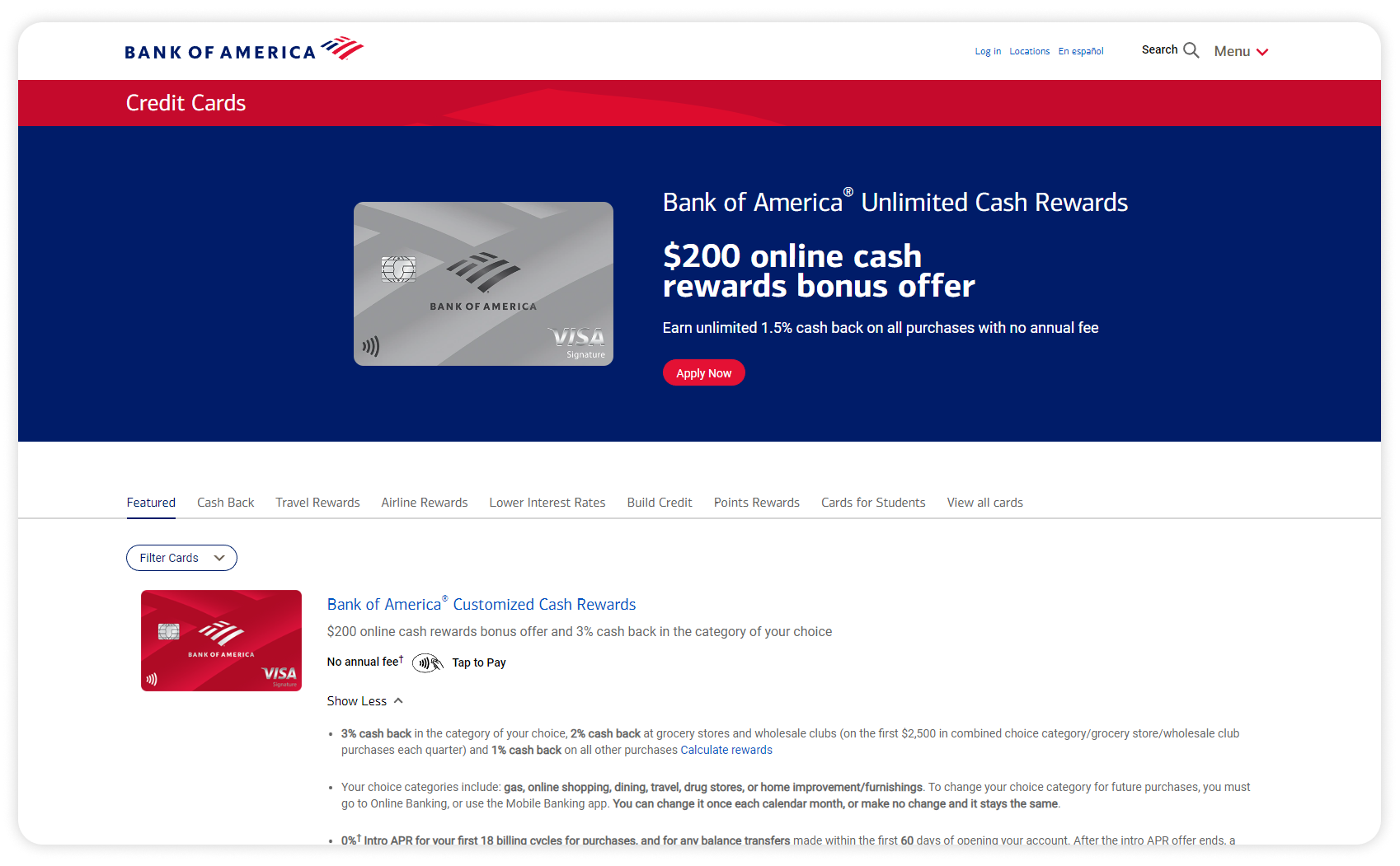
During my tenure at Bank of America, I had the opportunity to lead a significant project focused on revamping the consumer journey for browsing and applying for credit cards. This initiative, aimed at millions of customers across the U.S., required navigating strict compliance regulations, adhering to established brand guidelines, and meeting Bank of America's high delivery standards. Despite being a challenging project with many problems to solve, my team and I created a solution informed by rigorous research, data analysis, and thorough testing. This stands as one of my proudest achievements.This project holds special significance for me because I understand how overwhelming it can be for consumers to navigate credit card options, especially those unfamiliar with the process. Enhancing this experience not only benefits the user by simplifying their decision-making but also supports the business by fostering customer satisfaction and loyalty.Mission- Identify usability problems and high drop-off points: Conduct thorough research to pinpoint friction points and understand reasons for drop-offs.
- Assist users in selecting the best credit card: Develop intuitive comparison tools and streamline the form-filling process.
- Ensure compliance and simplicity: Design a visually appealing and legally compliant interface.
- Optimise user journey: Implement features to guide users through the process efficiently.Goals- Simplified user experience: Reduced drop-off rates and improved customer satisfaction.
- Enhanced features: Modernised tools for comparison and selection.
- Compliant and engaging interface: Designed a visually appealing UI while ensuring legal compliance.
Analysis & Approach: So many methods and tools available to me!
First, a little context. I joined Bank of America as a product designer, collaborating within a dedicated team comprising designers, researchers, business analysts, and developers. Our collective mission was to revamp and contemporize the credit card application journey, focusing on enhancing the user experience. Recognising the pivotal role of research and analysis in shaping user-centric solutions, I immersed myself in this process to ensure our product would resonate with users. This role proved deeply rewarding, which motivated me throughout the project. I am immensely proud of what we accomplished and the final product delivered.At Bank of America, I had the privilege of accessing a vast array of resources to conduct comprehensive and meaningful research. I approach this process with great seriousness, dividing it into two distinct phases: research and analysis.ResearchIn the research phase, the strength lies in numbers, and this applies to qualitative data as well. Gathering a diverse range of opinions and thoughts allows us to discern patterns and insights during the analysis phase. Our research methods included:- User Interviews: Engaging with actual users to understand their experiences, pain points, and needs.
- Usability Tests: Conducting usability tests on both competitors' platforms and our existing journey, with the privilege of being enhanced with eye-tracking.
- Surveys: Distributing surveys to a broader audience to collect quantitative data on user preferences and behaviours.
- Competitor Analysis: Analysing competitor offerings to benchmark our solutions and identify opportunities for improvement, and industry conventions.Analysis FindingsMaking sense of the often chaotic findings from the research phase is crucial. To achieve this, I organised a whiteboard workshop where designers, researchers, industry experts, and product owners collaborated. During these sessions, we brainstormed, negotiated, and prioritised the most pressing problems and potential solutions.The major issues we identified and prioritised were:- Non-Intuitive, Industry-Specific Language: Users struggled with understanding technical terms, which was described as “off-putting”.
- Difficulty Comparing Credit Card Options: The current setup made it challenging for users to easily compare different credit card features and benefits.
- Overwhelming Form Design: The form users needed to fill out was perceived as lengthy and daunting.
- Overwhelming Number of Options: Users were often overwhelmed by the sheer number of credit card choices, with no clear guidance, comparison or encouragement to proceed with an application.- Addressing these issues was pivotal in our effort to improve the user journey. By methodically breaking down and analysing our research findings, we were able to identify the core problems and devise effective, user-centric solutions.
Solution Outline: Crafted Based On Real ProblemsBased on the insights gained during my research and planning stages, I crafted a detailed solution targeting the key issues identified. This solution incorporates intuitive design principles and user-focused features to significantly improve the overall user experience. In the subsequent sections, I will thoroughly explain my solution, supported by pertinent screenshots. Each screenshot will highlight a specific problem and the respective design solution, showcasing how each facet of the user experience has been carefully considered and enhanced.Card Comparison FeatureDuring our market research phase, we identified an emerging trend: the ability to compare credit cards side-by-side. This feature directly addressed a significant pain point highlighted during user testing of our existing system. Users frequently expressed feeling overwhelmed by the amount of information they needed to remember before checking other cards. One user even mentioned resorting to taking pictures of card descriptions on their phone to facilitate comparison.To tackle this issue, I gathered screenshots of competitors' comparison features to understand current market conventions. I also recommended conducting user testing on these competitor platforms, which proved invaluable in helping us identify ways to build a superior solution.Key User Issues Identified on Our Current Site:- Users found it challenging to digest and mentally compare the vast amount of data points available.
- The lack of a comparison feature forced users to rely on memory or external aids, like taking photos, to compare cards.Key User Issues Identified on Competitors:- While competitors did offer a comparison feature, it was often limited to only two items side-by-side. Despite this limitation, users preferred this option over having no comparison tool.
- The comparison feature on competitor sites was often not prominently displayed, typically accessible only via a button at the bottom of the page.Development of Our Card Comparison Feature:Based on these insights, we set out to create a robust card comparison feature that would enhance the user experience by making it easier to evaluate multiple credit cards simultaneously. Our solution incorporated the following improvements:- Visible and Accessible Placement: Unlike competitors, we ensured that the comparison tool was prominently displayed and easily accessible on the credit card browsing page.
- Comparison of Multiple Cards: We allowed users to compare more than two cards side-by-side, addressing the limitation noted in competitor offerings.
- Intuitive Design: The comparison interface was designed to be user-friendly, with clear, concise information and visual aids to help users quickly understand the differences and similarities between cards.By implementing these features, we aimed to alleviate the cognitive load on users, streamline their decision-making process, and ultimately enhance their overall experience on our platform. The card comparison tool not only addressed a critical user need but also positioned our platform as a leader in user-centric design within the credit card market.
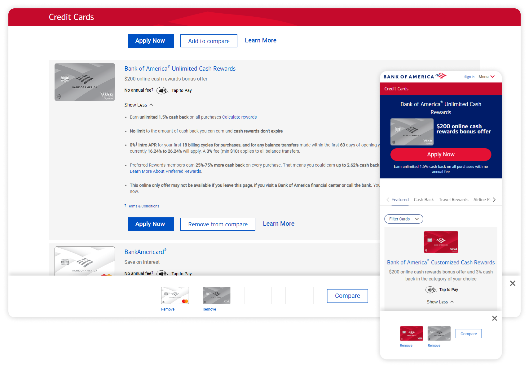
To address the issues identified in our research, my solution includes a streamlined feature allowing users to add up to four cards to a comparison list. This number is based on our data analytics, which indicated that the average user browses around four cards before making a decision or leaving the site. For mobile users, the limit is set to two cards due to visibility constraints.Seamless Integration into Card Grid:Instead of redirecting users to a separate comparison page, the comparison feature is integrated directly into the card grid. This ensures the feature is prominently displayed and easily accessible, enhancing user engagement.Sticky Tray for Added Cards:When a user selects cards to compare, a sticky tray appears at the bottom of the screen. This tray provides a clear visual of the selected cards, the number of additional cards that can be added, and options to deselect cards. This design ensures users have constant visibility and control over their selections without navigating away from the browsing page.User-Friendly Comparison Process:Once users are satisfied with their selections, they may click the “Compare” CTA to proceed to the comparison grid. This grid displays the selected cards side-by-side, allowing users to easily evaluate the differences and similarities.
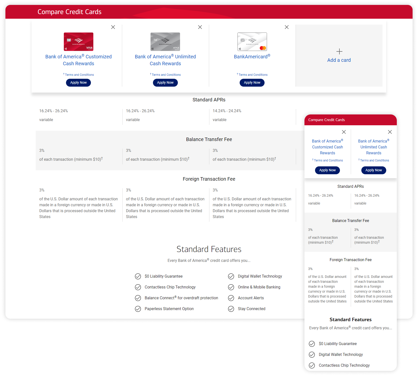
We addressed key issues like overwhelming information and difficulty comparing credit cards by integrating a comparison feature directly into the card grid. Users can add up to four cards (two on mobile) to a sticky tray for easy side-by-side comparison, all without leaving the browsing page. This streamlined solution, validated through user testing and data analysis, significantly improves the credit card selection process, making it more intuitive and efficient.Consumer Findings, and Better Selling PointsOur extensive research revealed that the credit card application process is often daunting for consumers, characterized by length, complexity, and uncertainty about acceptance, especially for those with lower credit ratings. This uncertainty can deter users and increase the difficulty from a business point of view, as there is a huge number of people in the market unhappy with their credit score or financial situation.To address these challenges, we aimed to make the process more appealing and maintain a positive user experience from browsing to application completion. Our research indicated that cashback rewards and interest rates, especially when coupled with no annual fee, are the most attractive features for consumers.We emphasised these key features through improved visual hierarchy, ensuring they stand out prominently. This approach helps draw attention to the most desirable aspects while minimising the impact of less user-friendly information. By focusing on these enhancements, we aimed to reduce user frustration, increase engagement, and encourage successful credit card applications.
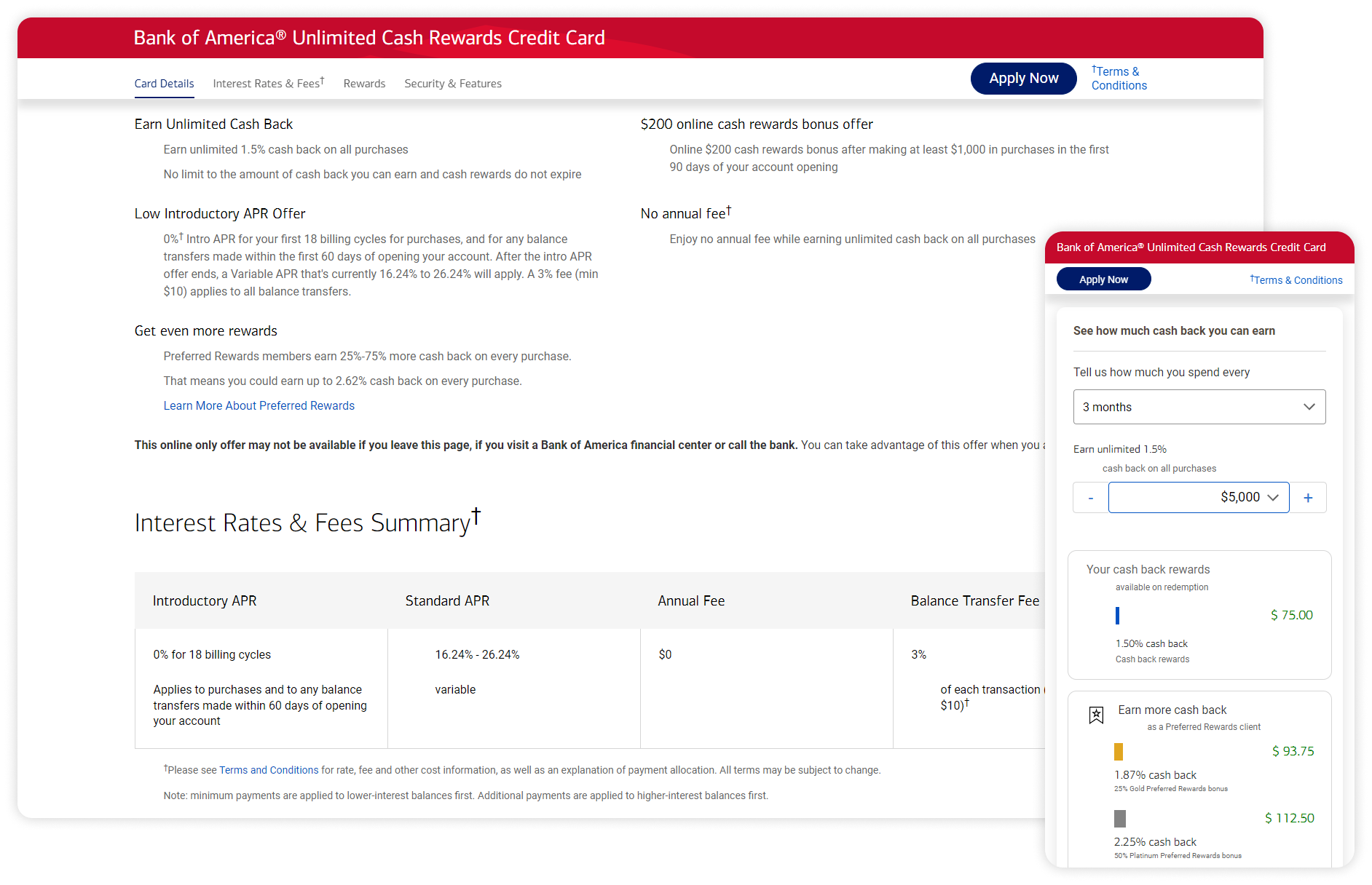
As shown above, once a user is on a specific credit card page, we want them to be drawn to the benefits and rewards. I added attractive selling points, whilst moving legal details below, remaining fully legal but less intimidating. The application CTA remained stuck to the top for easy access, keeping the user focused on the attractive rewards and the application CTA.To add a more immersive, personal experience, I noted an idea that I found during our market research phase: a rival bank had implemented a quick calculator to see how much cashback translates to in dollars, not a percentage, based on spending. For my version, I added a drop-down for the user to select a timeframe, as well as a rounded spending amount; it then instantly gives the amount they would be saving within that timeframe. This can be seen in my mobile screenshot above.Lastly, The ApplicationWe simplified the entire user journey to be as easy and attractive as possible across all platforms, culminating in the critical application step. While users may browse extensively, business success hinges on them completing and submitting the application, a step where many typically drop off. Ensuring a smooth application process is therefore crucial.This is something I decided to allocate a lot of time to. Drawing from my extensive experience in form design, I focused on implementing best practices to optimise the user experience:- In-line Validation: Providing immediate feedback to users as they fill out the form.
- Top Label Alignment: Ensuring labels are placed directly above form fields for easy readability.
- Bottom Hint Alignment: Placing hints or instructions below the relevant fields to guide users.
- Progress Indication: Showing users their progress through the application to keep them informed and motivated.
- Disclosure: Clearly explaining why certain information is needed to build trust and transparency.
- Contextually Varying Field Lengths: Adjusting field lengths based on the expected input to improve usability.
- Constraints: Applying appropriate constraints to fields to prevent errors and guide correct input.By incorporating these elements, we aimed to reduce drop-offs, enhance user satisfaction, and increase the overall success rate of credit card applications.
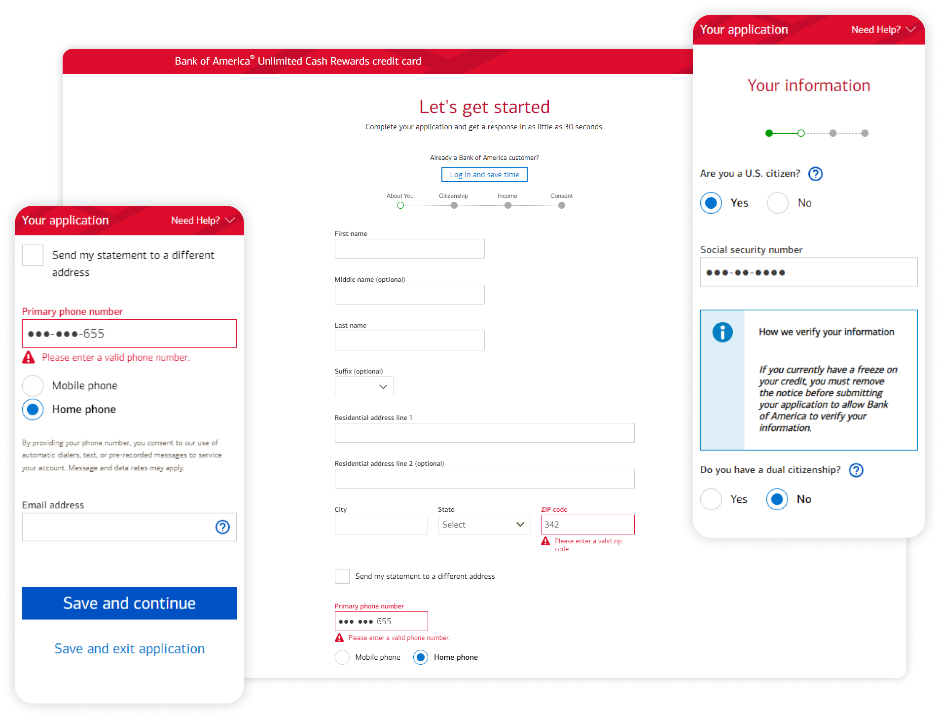
I worked extremely closely with the developers to get the form right, to avoid user frustration, as well as disclosure for reassurance of security when inputting sensitive details. I ensured our software was able to explain why and how certain data is processed.By implementing these best practices and focusing on user-centric design, we achieved a significant improvement in the application process. User feedback indicated a marked reduction in frustration, and analytics showed a higher completion rate for applications. The collaboration between UX design and development was instrumental in this success, ensuring that the form not only met technical requirements but also delivered a superior user experience.
A little conclusion, and looking forwardEmbarking on this journey to enhance the credit card browsing and application experience at Bank of America has been a rewarding opportunity. I am immensely grateful for the chance to apply my skills and expertise to such a meaningful project, one that directly impacts millions of users, at such a recognisable company.Throughout this process, our focus on good research practices, clear problem-solving strategies, and effective collaboration has been pivotal. By prioritising user needs identified through extensive research, we streamlined the browsing journey and simplified the application process, ultimately delivering a more seamless and intuitive experience for users.In the spirit of continuous improvement, I recognise the importance of incorporating user feedback loops into our process for future projects. This iterative approach, coupled with improved communication and alignment between cross-functional teams, will further optimise our development process and lead to even more impactful results.This case study underscores the importance of putting the user at the centre of design decisions, leveraging robust research methodologies, fostering collaboration, and maintaining open channels of communication. By adhering to these principles, we can continue to deliver exceptional user experiences that drive business success.As we reflect on our achievements, it's important to quantify the impact of our efforts. According to our analytics, we've observed a significant increase in user engagement, with a reduction in bounce rates on the credit card browsing pages. Additionally, our application completion rates have improved, indicating a smoother and more user-friendly process.
TC Co-Pilot
Evolving a simple AI chatbot into a business-critical platform for 4,000+ travel experts
Introduction
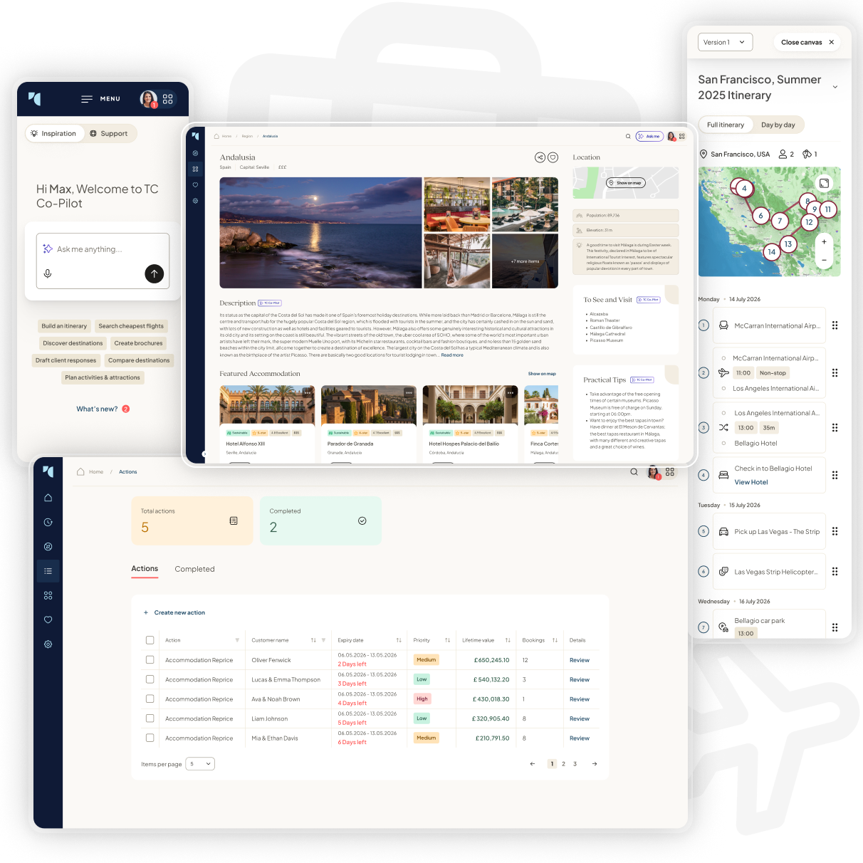
TC Co-Pilot is Travel Counsellors’ flagship AI product, used by over 4,000 independent travel businesses and self-employed travel experts worldwide. It sits inside a wider ecosystem of booking tools, customer data, marketing support and business management products used by Travel Counsellors every day to run and grow their businesses.When I first joined, Co-Pilot had only recently launched and was still relatively narrow in scope. It was essentially a travel-focused chatbot. It could recommend hotels, suggest the best time to visit destinations such as Jamaica, help draft simple emails and answer general travel questions. It had value, but it was still closer to a branded AI assistant than a deeply integrated business tool. It helped around the edges of a Travel Counsellor’s workflow, rather than becoming part of the workflow itself.I saw a much larger opportunity. Travel Counsellors were already aware of tools like ChatGPT, Claude and Gemini, but those tools could not understand our ecosystem, our hotel data, our customer relationships, our booking workflows or the way TCs actually sell travel. My challenge was to help transform TC Co-Pilot from a simple chatbot into something more specific, more trusted and more commercially useful: an AI-powered CRM tool, content generation hub, itinerary planner, travel research assistant and proactive business companion.Rather than treating AI as a feature, I approached Co-Pilot as a product ecosystem. I used research findings, TC feedback and my own product thinking to identify where AI could genuinely save time, improve quality and help TCs create more repeat business. The result was a more ambitious direction for Co-Pilot: a tool that could help Travel Counsellors plan better trips, communicate more professionally, market themselves more effectively and act on customer opportunities at the right time.
The challenge
Travel Counsellors are not traditional travel agents working inside one shared shop or office. They are self-employed travel experts running their own businesses, often managing every part of the customer relationship themselves. On any given day, a TC might be researching destinations, comparing hotels, writing emails, building itineraries, creating social content, following up with past customers, managing enquiries and trying to win repeat bookings.That made Co-Pilot’s potential much bigger than simple question answering. The real challenge was not “how do we add AI into the platform?” It was “how do we design AI that helps TCs run better businesses?”At the time, generic AI tools were already creating pressure. Some TCs were using ChatGPT or similar products because they were fast and familiar. However, those tools had clear limitations. They were not connected to Travel Counsellors’ booking ecosystem, they could suggest hotels or activities that were not relevant or available, and they did not understand the TC brand, customer context or commercial model. They also meant valuable data and insight were leaving our platform.I needed to help make TC Co-Pilot good enough that TCs would choose it over generic AI tools, not because they were forced to, but because it was more useful. That meant designing a product that was deeply connected to the way TCs actually worked, while still feeling as simple and approachable as the AI tools they already knew.
My role
I worked across the product end-to-end, from research synthesis and UX strategy through to interaction design, high-fidelity UI and product storytelling. This was not a case where I was simply handed a set of requirements and asked to make screens. I helped define what Co-Pilot could become, how it should behave, what workflows it should support and how it could deliver more value to both Travel Counsellors and the wider business.I took TC feedback and research findings, identified patterns, translated them into design opportunities and then turned those opportunities into product concepts and detailed interface designs. I worked across several interconnected areas, including hotel recommendations, region research, campaign generation, itinerary planning, CRM-style actions, email assistance, personalisation, feature discovery and adoption.Because Co-Pilot touched so many parts of the TC workflow, I had to think beyond individual screens. I had to consider how each feature connected to the wider product ecosystem, how users would move between tasks, how AI outputs should be trusted, edited and acted on, and how to support both confident and less technically confident users. My role was to make Co-Pilot feel less like a novelty and more like a serious business tool.
Research and discovery: understanding where AI was actually usefulI started by looking closely at how TCs were using Co-Pilot and where the experience was breaking down. The most important insight was that users did not just want impressive AI responses. They wanted useful, trustworthy outputs they could confidently act on with real customers.Research showed recurring issues around trust, discoverability, control and workflow fit. TCs wanted clearer ways to generate customer-facing PDFs, stronger hotel recommendation logic, better location context, more control over written tone, easier access to pinned chats and clearer ways to understand what Co-Pilot could actually do. Some users compared the experience directly to tools like ChatGPT, Gemini and Perplexity, which meant there was already a mental model we had to respect. At the same time, Co-Pilot needed to offer something those tools could not: deeper travel context and business-specific value.I used those findings to shape a set of design principles for the product. Co-Pilot needed to keep users in flow, rather than forcing them to jump between multiple tools. It needed to make AI outputs feel trustworthy through structure, evidence and validation. It needed to give TCs control over tone, format and final output. Most importantly, it needed to move from simply responding to prompts towards helping TCs complete real tasks.This research changed the direction of the product. Instead of designing a better chatbot, I began designing a broader AI workspace built around the jobs TCs needed to complete every day.
1. Repositioning Co-Pilot from chatbot to AI workspaceWhen I first worked on Co-Pilot, the product was useful but limited. It could answer travel questions and generate basic responses, but it did not yet feel like an essential part of a TC’s working day. Users could ask it for help, but it was not proactively helping them plan trips, market their business or manage customer relationships.My task was to help define a stronger product direction that would make Co-Pilot more valuable than generic AI tools. I needed to identify the highest-value TC workflows and design ways for Co-Pilot to support them in a more structured, connected and commercially meaningful way.I reframed Co-Pilot around real jobs-to-be-done. Instead of seeing it as one chat interface, I broke the opportunity down into a suite of AI-powered workflows: finding and comparing hotels, researching regions, creating customer itineraries, generating social campaigns, drafting emails, surfacing CRM actions, personalising the assistant and educating users on what the tool could do.This gave the product a clearer structure. Each area had a defined purpose and could be designed around a real user need rather than a vague “ask AI anything” model. I used this approach to create a more scalable product direction, where Co-Pilot could grow into multiple business-critical tools while still feeling like one connected assistant.The product moved from being a simple chatbot concept to a more ambitious AI operating layer for Travel Counsellors. This created a stronger foundation for adoption because the value was no longer abstract. Co-Pilot was not just there to answer questions. It could help TCs save time, create better customer outputs, improve marketing quality and identify commercial opportunities.
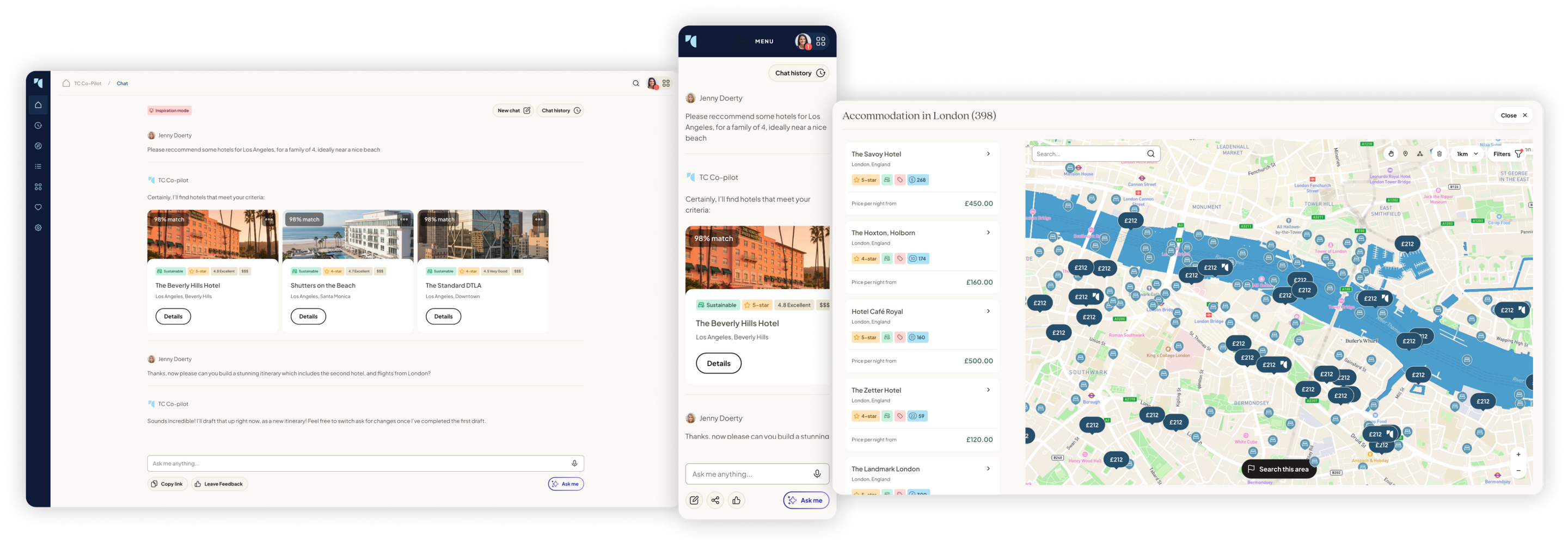
2. Hotel recommendations: making AI outputs feel trustworthyHotel recommendations were one of the most obvious early use cases for Co-Pilot, but they also exposed one of the biggest challenges with AI: trust. A TC cannot simply send a customer a hotel suggestion because an AI assistant says it is good. They need to understand why it has been recommended, whether it fits the customer’s brief and whether it is suitable from a Travel Counsellors perspective.I identified that plain text answers were not strong enough for this use case. They made recommendations feel generic, hard to compare and sometimes difficult to verify. I designed hotel recommendations as structured cards, giving users a clearer way to scan options, compare key details and judge whether a recommendation was appropriate. The card format also created space for richer signals, such as review scores, location context, key selling points, facilities and potential Travel Counsellors validation.I also considered how Co-Pilot could use the strength of the TC network. If certain hotels were frequently booked, highly rated or recommended by other TCs, that could become a trust signal inside the interface. This was important because it made Co-Pilot feel less like a generic AI pulling information from anywhere and more like a product shaped by the collective knowledge of Travel Counsellors.The goal was to reduce the amount of manual verification TCs had to do after receiving a recommendation. By making the output more structured, visual and evidence-based, I helped position Co-Pilot as something users could work with more confidently.
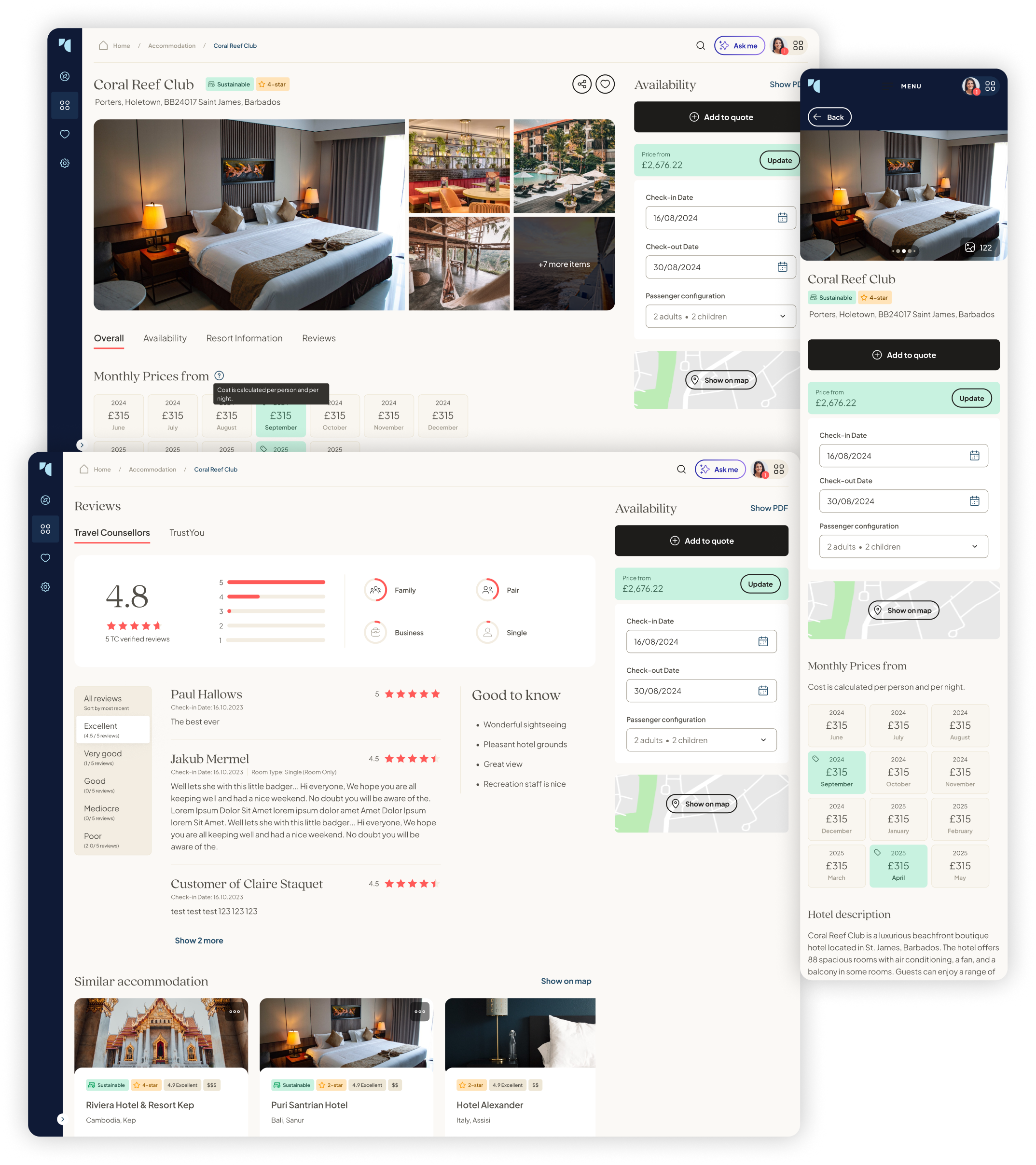
3. Region research: turning destination knowledge into a reusable reference pointDestination and region research was another area where Co-Pilot could support TCs beyond simple chat. TCs often need to quickly understand a region, explain it to customers and make recommendations based on trip type, seasonality, geography, budget or traveller profile.I designed the region experience as a reference point rather than a long AI answer. The aim was to make destination knowledge easier to scan, revisit and use in conversation with customers. Instead of presenting users with a wall of text, I wanted Co-Pilot to organise information in a way that supported decision-making: what the region is known for, when to visit, who it suits, what to avoid and which nearby areas or hotels may be relevant.This was an important shift because TCs do not always need AI to “write” for them. Sometimes they need AI to organise knowledge, speed up research and help them feel prepared for a customer conversation. Designing the region experience this way helped Co-Pilot become a practical working tool rather than just a content generator.
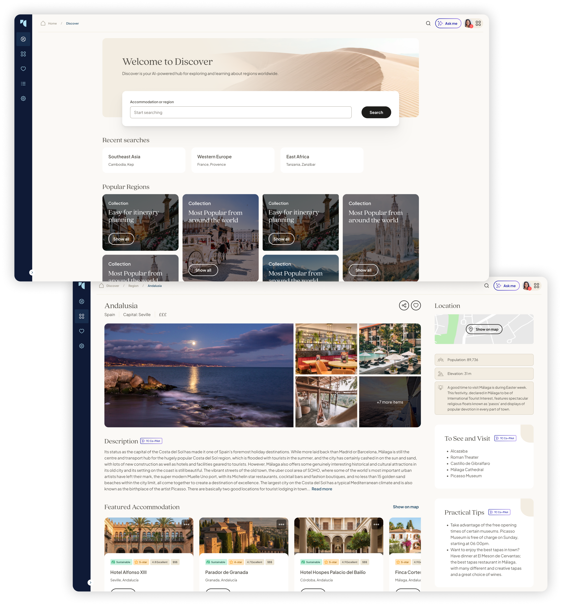
4. Itineraries: reducing hours of manual planningItinerary planning is one of the most time-consuming and valuable parts of a TC’s work. A strong itinerary can help win a booking, reassure a customer and show the value of using a Travel Counsellor rather than booking independently. However, building one properly can take hours, and in some cases days, especially when the TC has to manually combine hotels, activities, transport, timings, destination notes and customer-friendly copy.Generic AI tools can generate itinerary drafts quickly, but they have a major weakness: they are not connected to our actual ecosystem. They might suggest an attraction, hotel or experience that looks good in theory but does not fit the customer, is not available through the relevant channels or creates extra work for the TC to validate afterwards.I designed the itinerary concept to make Co-Pilot feel more like an editable planning workspace than a text generator. I took inspiration from products such as Mindtrip, but adapted the experience for the Travel Counsellors context. The interface needed to help TCs create day-by-day plans, review suggested hotels and activities, edit sections, refine the tone and prepare something that could become customer-facing.My focus was on keeping the TC in control. Co-Pilot could generate the first draft, suggest relevant components and organise the structure, but the TC remained the expert who shaped the final recommendation. That distinction mattered. The product should save time without undermining the personal expertise that makes Travel Counsellors valuable. When usability testing our first solution, a common issue users encountered was organising their itinerary once completed. I decided to implement drag-and-drop functionality in a later iteration to combat this simple issue, which would save plenty of time from users constantly asking their AI chatbot for adjustments, and correcting mistakes too.This concept showed how Co-Pilot could move beyond simple AI assistance into a genuine productivity tool. By integrating itinerary creation with Travel Counsellors’ data and workflows, the experience had the potential to save significant planning time while reducing the risk of unusable or unavailable recommendations.
5. Campaigns: helping TCs market themselves with better contentA major part of a Travel Counsellor’s success comes from their ability to market themselves. Many TCs use social media to stay visible, inspire customers and generate enquiries, but not every TC has the time, confidence or design skill to create polished content consistently.I saw Campaigns as an opportunity to solve a very practical business problem. Some TCs were using low-quality imagery, inconsistent templates or generic copy, which could make their marketing feel less professional. This did not just affect aesthetics. It could affect customer trust, enquiry quality and ultimately revenue.I designed a Campaigns experience that helped TCs generate professional-grade social content for Instagram, Facebook and LinkedIn. The concept combined AI-generated copy with stronger imagery, templates and platform-specific formats. The aim was to make professional marketing easier, while still allowing each TC to personalise the final output so their content did not feel generic or identical to everyone else’s.I wanted the experience to feel guided rather than intimidating. Instead of asking users to start with a blank prompt, Co-Pilot could help them choose a destination, campaign type, audience and tone. From there, it could produce posts, captions and imagery that were much closer to being ready to use.This was one of the clearest examples of Co-Pilot becoming a growth tool. It was not just saving time, it was helping TCs present themselves more professionally and create better customer touchpoints.
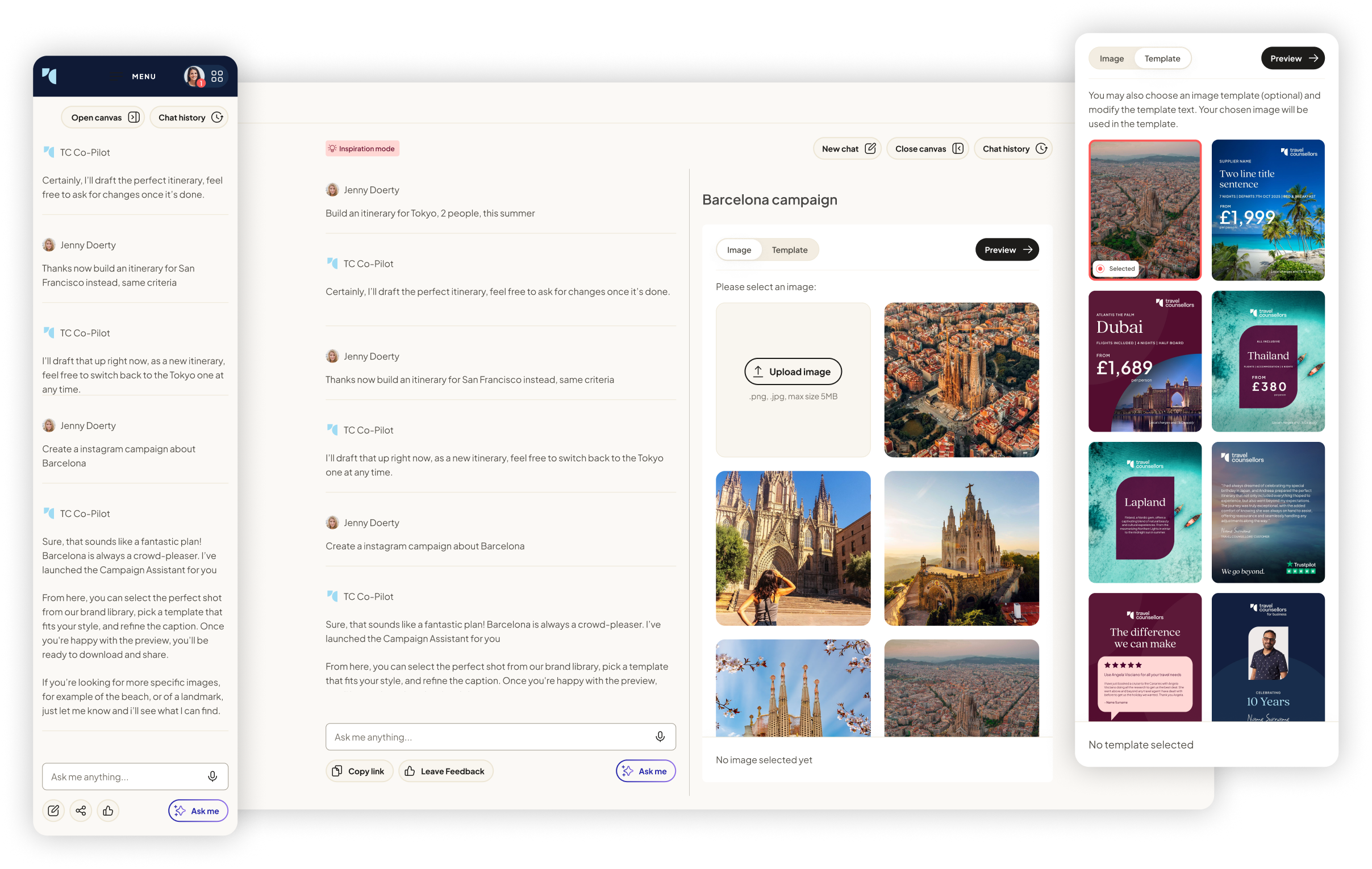
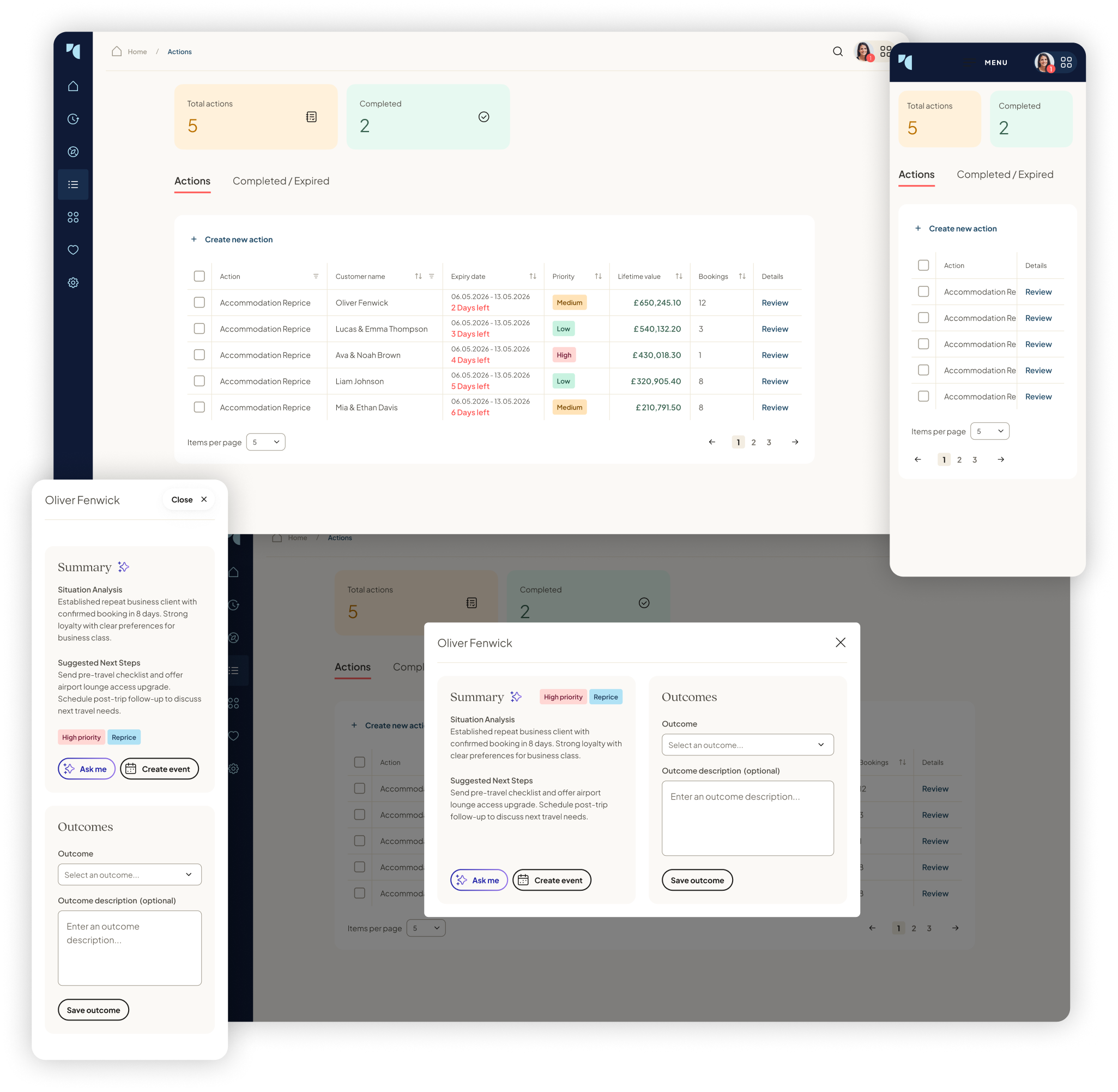
6. Actions: turning Co-Pilot into a proactive CRM assistantThe Actions concept was one of the most strategically important parts of my work on Co-Pilot. Up to this point, most AI interactions were reactive: the user asked something and Co-Pilot responded. I wanted to explore what would happen if Co-Pilot could proactively identify useful things for a TC to do.The idea was that Co-Pilot could scan customer and booking context, then surface actions that could help TCs strengthen relationships, follow up at the right time and create more repeat business. This could include reminding a TC to check in after a customer returned from holiday, suggesting a follow-up for someone who had not booked in a while, identifying an anniversary or seasonal opportunity, or recommending a relevant destination based on previous enquiries.I designed Actions around the idea of explainability. It was not enough for Co-Pilot to simply say “contact this customer”. It needed to explain why the action mattered, what the opportunity was and what the TC could do next. That helped the feature feel useful rather than intrusive.This moved Co-Pilot closer to becoming an AI-powered CRM layer. It could help TCs act on opportunities they might otherwise miss, while still leaving the relationship and final decision in the hands of the TC. From a product and business perspective, this connected AI directly to retention, repeat bookings and revenue generation.
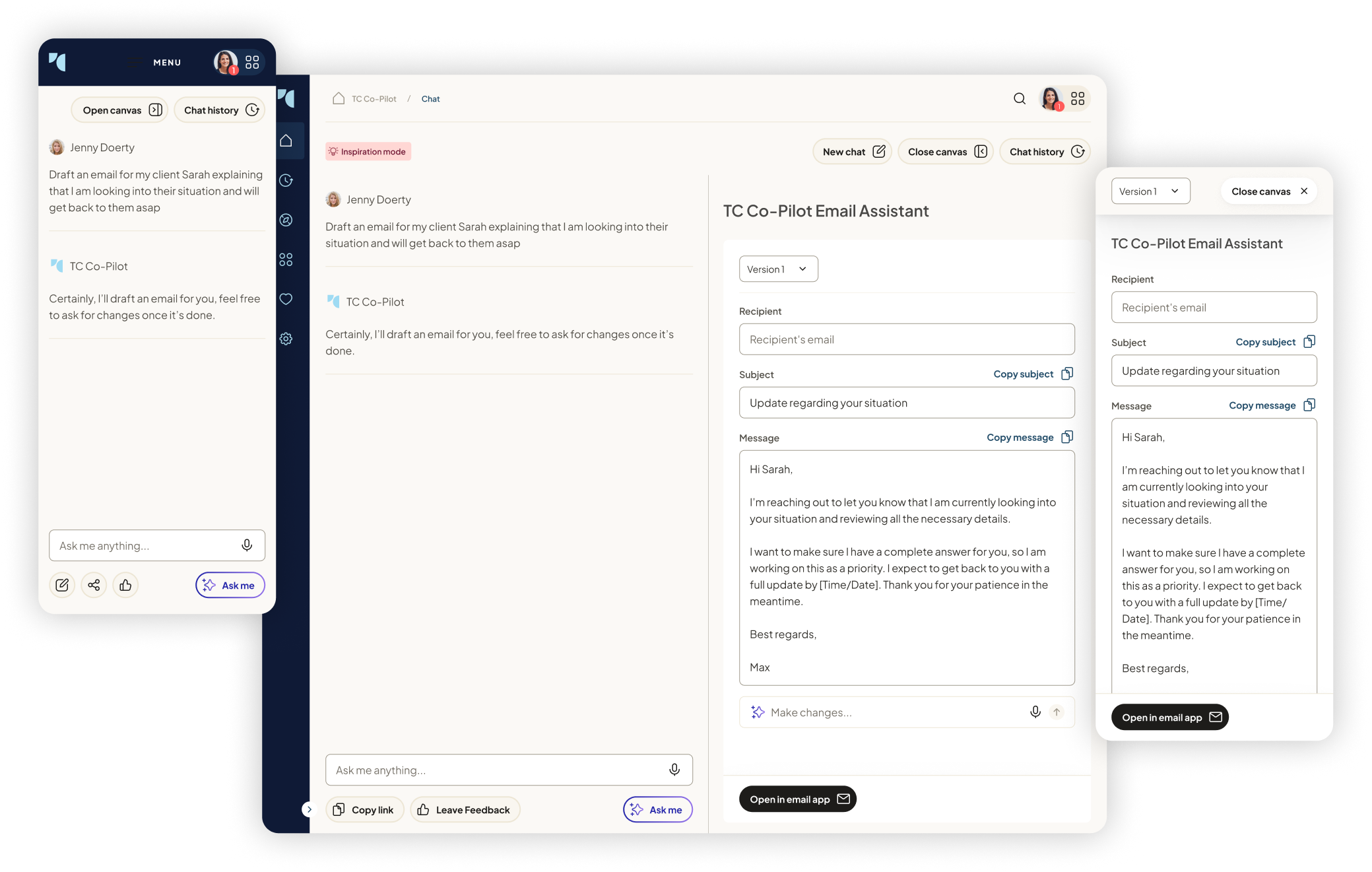
7. Email Assistant: designing better control over customer communicationEmail is one of the most frequent and important parts of a TC’s workflow. TCs need to respond quickly, but they also need to sound personal, natural and professional. A generic chatbot response was not enough because customer communication has nuance: tone, context, confidence and brand all matter.Research and feedback showed that some AI-generated writing could feel too robotic, too enthusiastic or too obviously AI-written. TCs sometimes had to spend time removing repeated AI patterns before they felt comfortable sending the copy. That told me the problem was not simply generating text. The problem was giving users enough control to make the text feel right.I designed the Email Assistant as a more focused experience than a normal chatbot. Rather than asking users to prompt from scratch, the interface could guide them around purpose, tone, length, customer context and desired outcome. I also considered refinement actions, allowing TCs to quickly make an email warmer, shorter, more professional, more concise or more tailored to a specific customer.The goal was to make email creation faster without making it feel careless. Co-Pilot should help TCs write better first drafts, but the TC should still feel ownership of the final message. This supported both efficiency and quality, which was essential for customer-facing communication.
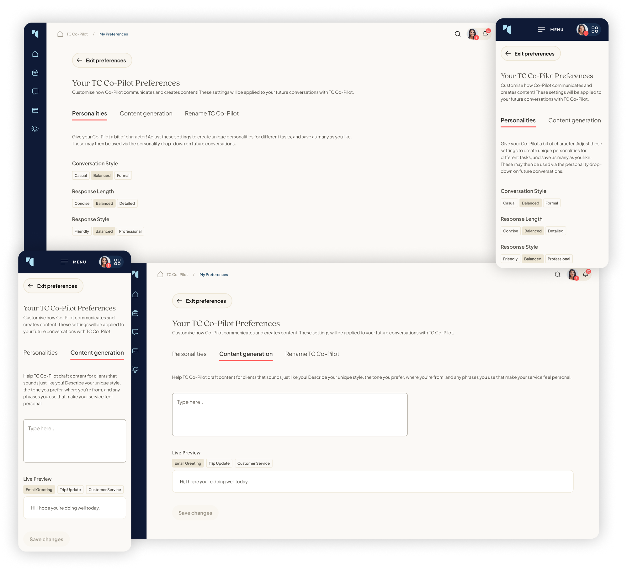
8. Customisation: separating assistant personality from customer-facing writingPersonalisation became an important theme as Co-Pilot expanded. TCs wanted the tool to understand their preferences, but I identified a key distinction: how Co-Pilot talks to the TC is not necessarily how it should write to customers.For example, a TC might want Co-Pilot to be direct, concise and practical when helping them work through tasks. However, when generating customer-facing content, they might want the tone to be warm, polished, luxurious or more conversational. Combining those settings into one generic “personality” would have created confusion.I designed the customisation experience to keep those needs separate. One part of the experience focused on how Co-Pilot behaves as an assistant: its tone, level of detail and working style. Another part focused on how it generates content for customers: writing style, brand personality, preferred phrases and communication preferences.This gave users more control and helped build trust. It also made Co-Pilot feel more personal to each TC without compromising the quality of the content they send externally. For a network of thousands of independent businesses, that balance was important. The product needed to feel scalable, but not one-size-fits-all.
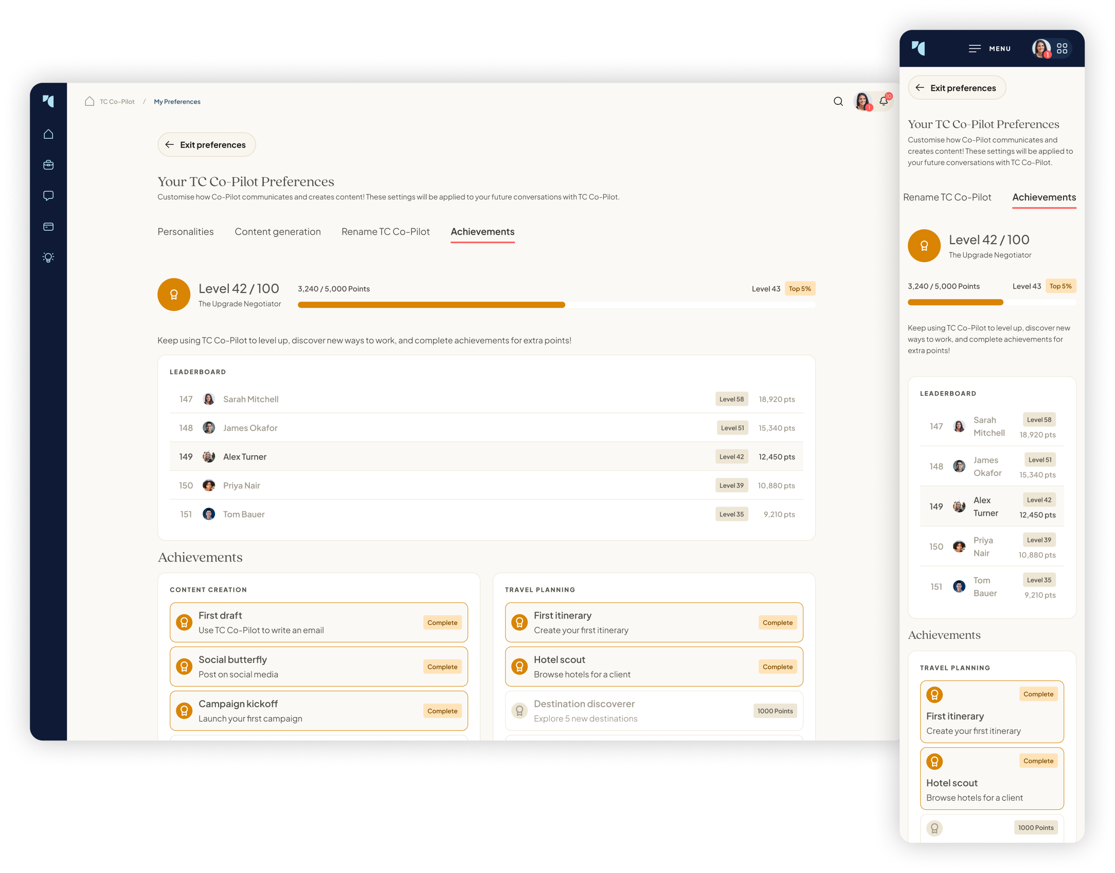
9. Achievements: encouraging adoption without making it feel forcedAs Co-Pilot grew from a chatbot into a larger suite of tools, adoption became a design challenge in its own right. A powerful product can still fail if users do not understand what it can do or do not build the habit of using it.I designed the Achievements concept to encourage TCs to explore Co-Pilot in a more engaging way. The idea was inspired by products such as Duolingo and Steam, where progress, milestones and achievements help users understand what they have done and what they can try next.I was careful not to make this feel like shallow gamification. The purpose was not to add badges for the sake of it. The purpose was to help TCs build confidence, discover features and feel rewarded for learning new ways to use Co-Pilot. For less technically confident users, this kind of positive reinforcement could make the product feel more approachable.Achievements also created a way to guide behaviour without heavy-handed onboarding. Instead of telling users everything upfront, Co-Pilot could gradually encourage them to try campaign generation, itinerary planning, email assistance or CRM actions as they became more comfortable.
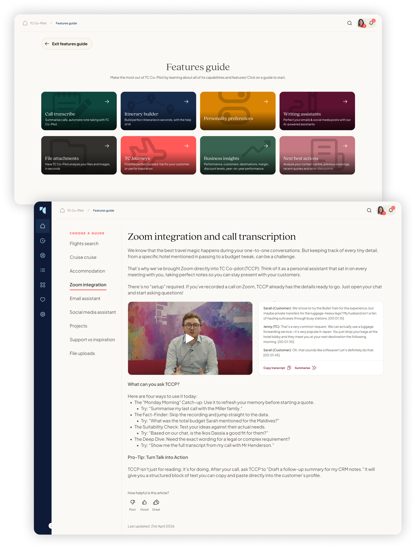
10. Feature Guide: helping users understand what Co-Pilot can actually doOne of the challenges with AI products is that users often do not know what is possible. A blank chat input can look simple, but it also places the burden on the user to think of the right prompt. That can be especially difficult for users who are less confident with technology or who do not yet have a strong mental model of AI.I designed the Feature Guide to make Co-Pilot’s capabilities easier to understand. Rather than expecting users to discover everything through trial and error, the guide gave them a clearer overview of the tools available, what each one was for and when they might use it.This was particularly important because Co-Pilot was becoming more than one feature. It included hotel recommendations, region research, campaign generation, itinerary planning, email support, actions and customisation. Without a clear guide, users could easily miss the most valuable parts of the product.The Feature Guide helped turn Co-Pilot from a mysterious AI box into a more understandable product. It supported onboarding, discoverability and confidence, while reducing the chance that users would return to external AI tools simply because they felt easier to understand.
11. Improving the core chat experienceAlthough much of my work focused on expanding Co-Pilot beyond chat, the core chat experience still mattered. It was the foundation users already understood, and small interaction issues could quickly damage confidence.I looked at several friction points surfaced through research and feedback. Users needed clearer ways to start a new chat, find pinned chats, switch between different modes, use prompt suggestions and generate outputs such as PDFs. Some of these were small UI details, but they had a real impact on how polished and predictable the product felt.I explored moving key actions to more expected positions, making pinned chats easier to find, improving mode visibility and making prompt suggestions behave in a way that matched user expectations. I also considered how Co-Pilot should respond when it could not complete an action, because error handling and limitations are especially important in AI products.These improvements were less visually dramatic than the larger feature concepts, but they were essential to the overall experience. A product like Co-Pilot needs to feel reliable at every step. If users lose trust in the small interactions, they are less likely to trust the bigger AI outputs.
Outcome and impactMy work helped reposition TC Co-Pilot from a simple travel chatbot into a much broader AI-powered business platform. I designed across the full product experience, from core usability improvements to entirely new workflows that connected AI to marketing, itinerary planning, customer communication and CRM-style actions.The biggest impact was the shift in product ambition. Co-Pilot was no longer just a support tool for travel questions. It became a way for TCs to work faster, create better content, make more informed recommendations and identify customer opportunities they might otherwise miss.For Travel Counsellors, this mattered because better TC productivity directly supports the wider business. If TCs can plan trips faster, market themselves better, communicate more professionally and increase repeat bookings, the platform becomes more valuable to the network as a whole.For users, the value was practical. Co-Pilot could save time, reduce manual effort, improve confidence and help them run their businesses more effectively. For the company, it created a stronger reason for TCs to stay inside the Travel Counsellors ecosystem rather than relying on external AI tools.
ConclusionTC Co-Pilot started as a simple AI chatbot, but I helped shape it into something much more ambitious: a connected AI platform designed around the real work of running a travel business.I did this by taking research and feedback, identifying the highest-value opportunities and designing a suite of tools that supported how TCs actually work. I moved the product direction beyond generic prompt-based assistance and into structured workflows for hotels, destinations, itineraries, campaigns, emails, customer actions, personalisation and adoption.The most important design challenge was not making AI feel clever. It was making AI feel useful, trusted and commercially relevant. Travel Counsellors needed a tool that could understand their ecosystem, support their customer relationships and help them grow their businesses in a way generic AI tools could not.This project allowed me to work at a strategic level, shaping the direction of a flagship product used by over 4,000 travel businesses worldwide, while also designing the detailed interactions that made the experience usable, approachable and valuable.For me, the strength of TC Co-Pilot is that it shows what AI can become when it is designed around real user workflows rather than novelty. It became a product that could help TCs save time, improve quality, build stronger customer relationships and create more repeat business, all from within the Travel Counsellors ecosystem.